

 Refresh
Make my logo Timeless and Memorable
Want to win a job like this?
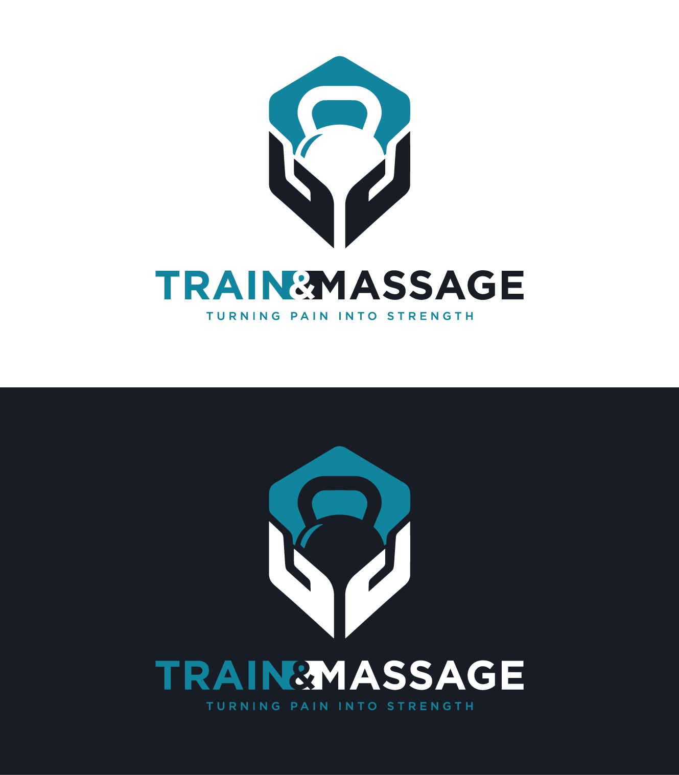
This customer received 438 logo designs from 192 designers. They chose this logo design from Deejah as the winning design.
Join for free Find Design Jobs
- Guaranteed
-
 US$340
-
 438 designs
-
 192 designers
Logo Design Brief
Update: ## Logo Design Direction
The logo should communicate **turning pain into strength**. Keep it simple, balanced, and easy to recognize.
### 1. Overall Shape
- Give the entire logo a clear and symmetrical outer shape.
- A circle or hexagon could work well.
- The individual elements should fit together to create one strong silhouette.
- For example, two hands and a kettlebell could be built from simple geometric shapes that form a hexagon.
- The outside perimeter should look intentional, not irregular or unfinished.
### 2. Kettlebell Reflection
- Add a simple shine or reflection mark to the **left side of the kettlebell**.
- The reflection should be wider near the outside-left edge.
- It should gradually become narrower as it moves toward the center, then disappear.
- From left to right, this subtly represents moving from pain or injury into strength.
- This symbolism should not be obvious at first glance. It should still look like a normal reflection on the kettlebell.
### 3. Negative Space
- Use negative space carefully to separate the hands, kettlebell, and other elements.
- The negative space can also help form subtle secondary shapes.
- Keep it clean and readable. Avoid adding details that make the logo feel crowded or difficult to understand.
### Main Goal
The final logo should feel:
- Strong
- Simple
- Balanced
- Symmetrical
- Easy to recognize at both large and small sizes
- Connected to the idea of **turning pain into strength**
---
I am not looking for a completely new logo. I’m looking for an evolution of my existing logo into something timeless, memorable, and iconic.
The current logo combines hands and a kettlebell to represent my brand philosophy: Turning Pain Into Strength.
The logo should represent the journey from pain to strength—not simply fitness, healthcare, massage, or medicine.
- OBJECTIVE -
Create a logo that feels like a modern brand mark rather than an illustration. I’m looking for something that is:
• Timeless
• Simple
• Bold
• Memorable
• Clean
• Scalable
• Instantly recognizable
• Modern & Clean
Think of logos like Nike, Apple, Patagonia, Target, or Under Armour—simple enough to recognize immediately and memorable enough to become synonymous with a brand.
- KEEP THE CORE IDEA -
Please keep the relationship between the hands and the kettlebell, but don’t feel locked into the current layout.
Feel free to explore:
• Different hand positions
• Different kettlebell proportions
• Different compositions
• Different interactions between the two elements
The goal is to preserve the meaning of the logo, not necessarily its exact design.
- DESIGN DIRECTION -
I’d like to see concepts that:
• Use strong, intentional shapes
• Work equally well in color or black and white
• Look great at very small sizes as well as large signage
• Uses Asymmetry to show transformation.
Add a small shine/reflection mark that also creates a cut or break in the shape. It should feel like a natural highlight first, not an obvious symbol.
The meaning behind it is transformation: the break represents pain or weakness, while the rest of the form represents becoming whole and strong.
Please avoid trendy effects like gradients, shadows, 3D styling, flames, lightning, ECG lines, spine graphics, or generic fitness imagery.
- OPTIONAL IDEAS (Not Required) -
These are creative directions I personally enjoy, but they are not requirements.
• Straight-Line Geometry
I like logos built primarily from straight lines that create the illusion of smooth curves, similar to the YoGorilla Mats logo. It creates a clean, geometric appearance while still feeling organic.
• Hidden Meaning / Negative Space
I enjoy logos that reveal something on a second look, such as the FedEx logo or the hidden animals in the San Diego Zoo logo.
If you can incorporate subtle negative space or a hidden visual element that strengthens the concept, I’d love to see it—but only if it feels natural and not forced.
- UPDATED THOUGHTS -
Add a small shine/reflection mark that also creates a cut or break in the shape. It should feel like a natural highlight first, not an obvious symbol.
The meaning behind it is transformation: the break represents pain or weakness, while the rest of the form represents becoming whole and strong.

Updates
Add a **small shine/reflection mark that also creates a cut or break in the shape**. It should feel like a natural highlight first, not an obvious symbol.
The meaning behind it is **transformation**: the break represents pain or weakness, while the rest of the form represents becoming whole and strong.
How that reflection/cut is shaped and incorporated into the logo is up to the designer.
Added Monday, 10 August 2026
Designs look the same
Logo Text
"Please See Images"
Colors
Colors selected by the customer to be used in the logo design:
Look and feel
Each slider illustrates characteristics of the customer's brand and the style your logo design should communicate.
Elegant
Bold
Playful
Serious
Traditional
Modern
Personable
Professional
Feminine
Masculine
Colorful
Conservative
Economical
Upmarket
Requirements
Should not have
- Dont use arrows in the negative space, its simply an example


