

 Refresh
New Logo for the Ossining Micro Fund
Want to win a job like this?
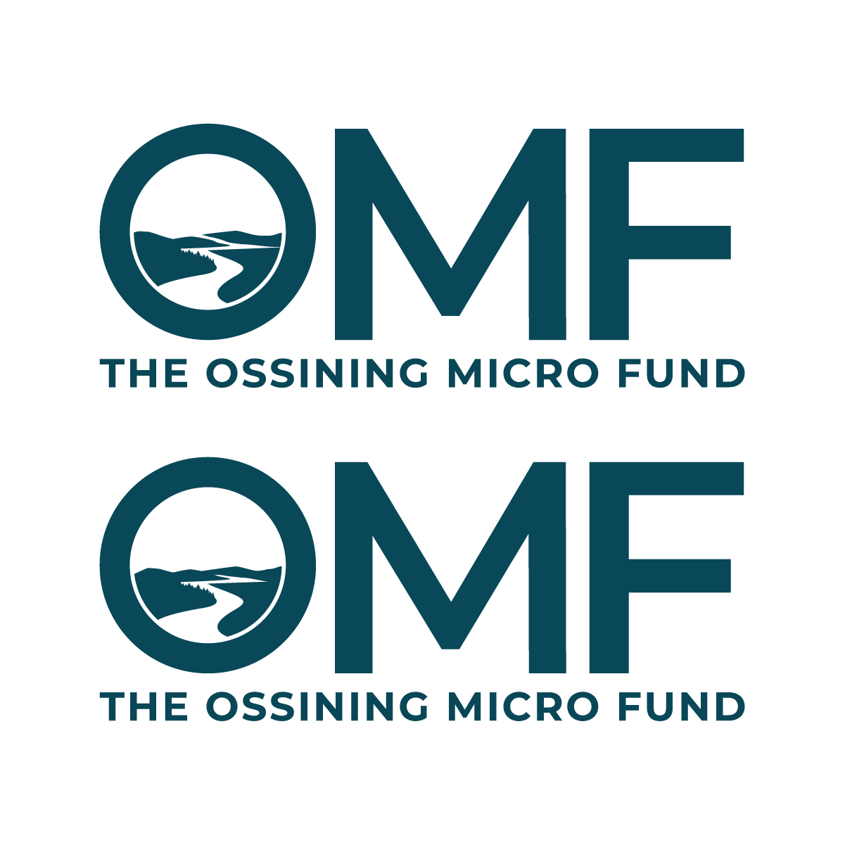
This customer received 201 logo designs from 67 designers. They chose this logo design from RAMBUTAN as the winning design.
Join for free Find Design Jobs
-
 US$110
-
 201 designs
-
 67 designers
Logo Design Brief
Logo Refinement Brief
The Ossining Micro Fund (OMF)
Direction: Refine and professionalize the existing Hudson River concept
About OMF
The Ossining Micro Fund is a small, community-based 501(c)(3) nonprofit serving communities along the Hudson River in Westchester County, New York.
We provide interest-free loans and individualized support to people experiencing temporary financial gaps. Our work helps people protect their housing, transportation, employment and financial stability.
OMF has been part of the community for more than 20 years. We want our identity to feel established and trustworthy, but also warm, accessible, optimistic and contemporary.
The Assignment
We are NOT looking for an entirely new logo concept.
We have developed a preliminary logo direction that we like and will provide it as a reference. We are looking for a skilled designer to refine and professionalize this concept.
The logo combines a stylized Hudson River landscape + OMF + THE OSSINING MICRO FUND.
The landscape is important because OMF serves communities along the Hudson River. We want the geographic connection to be recognizable but subtle.
The existing concept should be treated as a starting point, not finished artwork. We want the designer to improve the proportions, curves, balance, typography, spacing and overall sophistication.
What We Like About the Current Concept
The central white negative space suggests the Hudson River, with hills or riverbanks on either side and more distant Hudson Valley hills or mountains behind it.
We particularly like that the river can also suggest a path forward, bridging a gap, movement, connection and place. These ideas relate naturally to OMF's work without using obvious financial or charitable symbols.
We also like the simplicity and strength of the large OMF initials.
What Needs Improvement
1. Refine the landscape. The hills and riverbanks need more elegant, intentional curves. The shapes should feel organic but highly designed - not like clip art or a generic landscape illustration.
2. Resolve the outer edges. Earlier versions had abrupt vertical edges on the far left and right, which made the landscape look as though it had been cropped from a rectangular picture. We prefer the newer direction in which the landforms end naturally. Please refine this further.
3. Simplify where necessary. We want enough landscape information to evoke the Hudson Valley, but not so much that it becomes an illustration. We are open to simplifying the number or shape of the distant hills if that produces a stronger mark.
4. Refine the river. The river should be created primarily through negative space. It should feel natural and flowing, but simple enough to remain recognizable at smaller sizes.
5. Improve the relationship between the landscape and OMF. The landscape currently sits above the letters. Please explore proportions and spacing so the landscape and initials feel like one cohesive logo, rather than an illustration placed above a wordmark.
6. Refine the typography. We like the strength of the bold sans-serif OMF, but the typeface is not fixed. We welcome improvements. THE OSSINING MICRO FUND should remain clearly readable as the organization's full name.
Style
We are looking for a logo that feels:
• Bold
• Clean
• Sophisticated
• Modern
• Warm
• Grounded
• Trustworthy
• Distinctive
The finished logo should feel appropriate for both a community nonprofit and a serious financial organization. It should not feel corporate or institutional to the point of being cold, but it should also not look cute, folksy or overly charitable.
Please Avoid
• Dollar signs, coins or currency
• Hands or handshakes
• People or heads
• Houses
• Hearts
• Trees or leaves
• Sunrises
• Arrows
• Literal bridges
• Detailed landscape illustrations
• Overly literal mountains
• Gradients or photographic effects
• Generic 'helping people' nonprofit imagery
We want the river and landscape to do the storytelling quietly.
Color
Our current direction uses deep Hudson blue/teal, green and muted blue.
However, we are deliberately interested in a logo that has some flexibility in its color palette. We may use different approved color combinations in different communications while maintaining the same recognizable mark.
Therefore, the design cannot depend on color to work.
A major test of the final design is whether it remains distinctive and attractive when reproduced entirely in one color/black and white.
Please show your proposed design in both full color and true one-color black.
We are interested in seeing thoughtful alternative palettes, but color experimentation should not replace refinement of the underlying mark.
Practical and Technical Requirements
The final logo must work at a range of sizes and in practical nonprofit applications, including:
• Website and mobile
• Social media and email
• Letterhead and envelopes
• Fundraising appeals and reply cards
• Reports and signage
• Photocopies and one-color printing
We will ultimately need vector artwork and standard web/print file formats, including versions suitable for light and dark backgrounds.

Updates
Gathering more feedback
Logo Text
OMF The Ossining Microfund
