

 Refresh
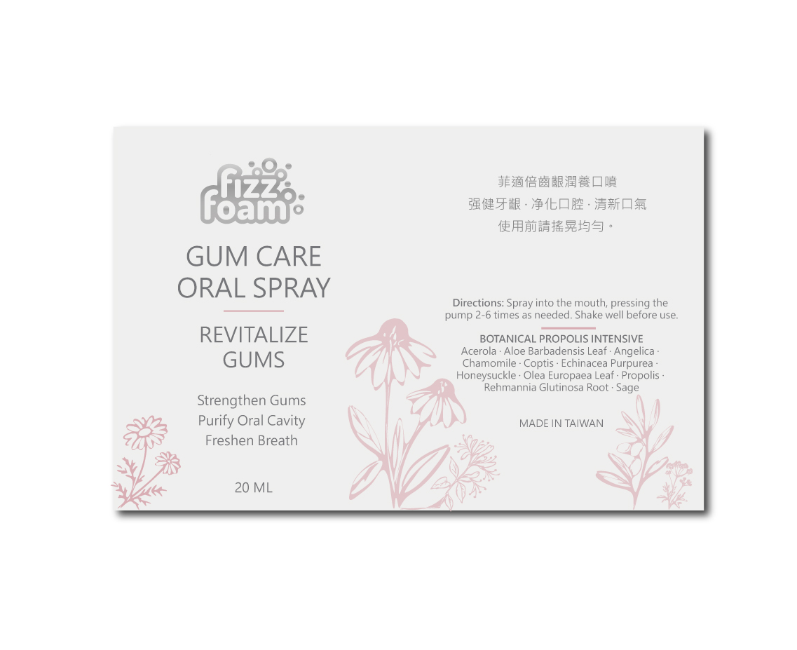
High-end Oral Spray Bottle Label Design
Want to win a job like this?
This customer received 168 packaging designs from 48 designers. They chose this packaging design from oltredisegno as the winning design.
Join for free Find Design Jobs
-
 NZ$490
-
 168 designs
-
 48 designers
Packaging Design Brief
Premium, cool, soft, clean, leaning toward oral care / fragrance; restrained with a sense of breathing room.
Color Direction
Use pearl white / milky gray-white as the base, with pink and dark gray text forming the visual hierarchy. Pink should be used sparingly, in small local areas, appearing as dots, small color blocks, lines, patterns, etc., as an accent or embellishment, not spread out or becoming the visual focus; overall soft, restrained, with a gentle feel but not overly sweet. Dark gray text should be close to black but softer, more understated, modern, and clean than pure black. Color codes to be chosen by the designer; specific placement and form to be determined by the designer.
Look and feel
Each slider illustrates characteristics of the customer's brand and the style your logo design should communicate.

