Logo (Certification Mark) Design Project
Want to win a job like this?
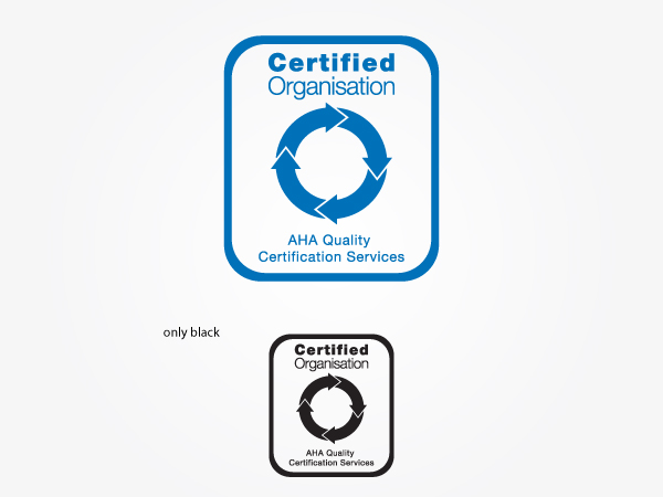
This customer received 118 logo designs from 30 designers. They chose this logo design from OUT of BOX.d as the winning design.
Join for free Find Design Jobs- Guaranteed
-
 A$400
A$400
-
 118 designs
-
 30 designers
Logo Design Brief
Please note this competition is NOT for a logo, it is for a certification mark - please read the following carefully and in full for an understanding of what we require.
AHA Quality Certification Services is a company that undertakes reviews and assessments of the systems and processes within organisations/businesses in order to provide them with a quality certification. We are able to provide quality certification under a range of recognised programs such as the internationally recognised ISO program.
In order to be certified, organisations must be able to demonstrate that they have sound processes in a broad range of areas relating to quality such as the way in which they manage/treat their customers and staff.
Organisations that are certified receive a certificate from AHA Quality Certification Services which indicates the quality standards under which they have been certified. Certified organisations may choose to display this certificate in a prominent location within their business premises, such as in their reception.
AHA Quality Certification Services already has a company logo but requires a certification mark, stamp or seal to be used on the certificates to be presented to certified organisations. This seal will be put in the bottom right of the certificate to act as an official mark of certification. It is this certification mark/seal that is the subject of this design project.
The following sets out our requirements for the certification mark:
- the main words in the Certification Mark should be 'Certified Organisation', these should be prominent in the design
- our company name 'AHA Quality Certification Services' should also be included/written somewhere in the certification mark however it should be smaller and less prominent than the words 'Certified Organisation'. The 'AHA' should also not be highlighted or made prominent, it should be the same size as the rest of the business name.
- we like the idea of a representation of the quality cycle being included in the design - i.e. three arrows with curved tails positioned with each arrow head pointing to the tail of another arrow so that the arrows create a circle. One option might be to have this as the main shape with the words written inside. We are however open to other options both including or excluding this quality cycle idea
- we are open to ideas on colour but advise that our logo is the following colour (four colour process) C - 100%, M - 44%, Y - 0%, K - 0%. We anticipate we will like designs that incorporate this colour and therefore match our logo.
- the certification mark must be designed so that it goes on a white background.
If you have further questions or want additional details please feel free to e-mail chay.boss-walker@ahaconsulting.com.au
Note - this is similar to a previous design project we conducted recently. After accepting and paying for the original design further discussions led to pur preferences changing which is why this similar design project is now being conducted.
Industry/Entity Type
Business
Logo Text
Certified Organisation
Logo styles of interest
Emblem Logo
Logo enclosed in a shape
Look and feel
Each slider illustrates characteristics of the customer's brand and the style your logo design should communicate.
Elegant
Bold
Playful
Serious
Traditional
Modern
Personable
Professional
Feminine
Masculine
Colorful
Conservative
Economical
Upmarket
Requirements
Must have
- - the words 'Certified Organisation' should be included in the design as the main / most prominent words
- our business name 'AHA Quality Certification Services' must also be included in the design but these should be smaller / less prominent than the words 'Certified Organisation'. Also - the 'AHA' of the business name should not be stylised or highlighted in any way - they should be the same font/size as the rest of the business name
- must be on a white background
Nice to have
- - include the same blue as our logo (refer brief above for four colour process %s)
- include a representation of the quality cycle (three arrows positioned in a circle - refer to brief for a better description)