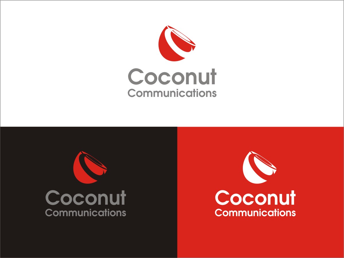
Logo Design for Coconut Communications
Want to win a job like this?
This customer received 31 logo designs from 4 designers. They chose this logo design from Sushma as the winning design.
Join for free Find Design Jobs-
 US$200
-
 31 designs
-
 4 designers
Logo Design Brief
We are a new telecommunications company that's going to launch a service which will be targetted for a Pacific Islander audience to call back home. The users of the service will be Pacific Islanders living in Australia, Canada, New Zealand, United Kingdom and United States though they will have strong ties back home.
The origins of our target audience will be Fiji Islanders, Samoans and Tongans who would like to call their friends and family back home. Our service will be available from their landline, mobile as well as an application from the mobile phone.
Our USP is a community feeling - we will support their local community by participating with their favourite rugby clubs, radio stations, community newspapers etc. etc. Additionally, we are oviously significantly cheaper than the regular incumbent telecom service providers like Telstra (www.telstra.com.au), Optus (www.optus.com.au), Telecom (www.telecom.co.nz, Orcon (www.orcon.net.nz), Vodafone (www.vodafone.com.au), etc.
We want to create an impression of community, professionalism, quality, safety and trust through our logo. Some of the logos we like are:
New Zealand Police - "Safer communities together"
http://www.police.govt.nz/sites/all/themes/nzp_omega/logo.png
Quintessentially - "Luxury vacation concierge service"
https://dynlopzyc1bfj.cloudfront.net/images/logo/top-new-2x.png
Vodafone - "Power to You"
http://vodafone.com/content/dam/group/menu/vf-logo.png
Fiji Airways
http://www.fijiairways.com/images/ui/logo.png
There are two parts to this project. The first is to design a logo for the company where we would like to make use of the colour red as well as coconut to symbolise our company. This might be trickier than usual as coconut is usually assosciated with a "tropical" setting but we are open to admire your creativity.
Taking a closer look at some of the larger communications companies, the colour red is quite prominent. Some examples of this are Airtel (www.airtel.co.in), Digicel (www.digicel.com), Ooredoo (www.ooredoo.com) and Vodafone (www.vodafone.com).
Some ideas around "coconut" that we liked are:
http://www.prosonidomiami.com/portafolio_img/Blue-Coconut-logo.jpg
http://www.webguysdirect.com/images/portfolio/logo/coconut-ink.jpg
The second part to the project is to support our multi-brand strategy by
We will have a multi-branded strategy as we will call our Fiji Island targeted product / plan "Tabua Talk", our Samoan targetted product / plan "Talofa" and our Tongan targeted product / plan "Fonua". We intend to market all three brands under "Coconut Communications" so an identity around "Coconut" is prime. However, we would like three emblems / symbols that each of the individual communities can associate themselves with when we market our services both online and in print.
A translation of the above words is as below:
Tabua - Whale Bone
Talofa - Hello
Fonua - Land
We highly recommend the designer conducting some independent research on Fiji Islands, Samoa and Tonga attempting design work to have familiarity with the Island culture. A tip here, blue is the national colour in Fiji so when making use of Tabua (whale bone) attempting to mix a combination of red and blue will be more appealing to the Fijian community. An example here is of Digicel Fiji who chose to modify their international logo to better communicate with the Fijian audience (e.g. http://www.digicelfiji.com)
Please remember we would like to see designs for all four elements in the project to make our final choice for the winning designer.
Updates
We are pleased to see your efforts and most of you are on the right track. Please remember we would like to see designs for all four elements in the project to make our final choice for the winning designer.
Added Sunday, March 16, 2014
Target Market(s)
Fiji Islanders, Samoans, Tongans.
Typically speaking, this target market is a low-income group in New Zealand.
We are aiming to target several age groups however.
18 - 25 Students
25 - 45 Working Class, Singles and Couples both Male and Female. Goal is to buy a home but since they have kids in New Zealand they want to pass down the Island culture to their children.
45 - 65 Older Age Group (Home Owners), thinking of settling back home after retirement.
65+ Retirees, wanting to connect with their friends who have moved back to the countries.
Industry/Entity Type
Telecommunications
Logo Text
Coconut Communications
Logo styles of interest
Character Logo
Logo with illustration or character
Lettermark Logo
Acronym or letter based logo (text only)
Look and feel
Each slider illustrates characteristics of the customer's brand and the style your logo design should communicate.
Elegant
Bold
Playful
Serious
Traditional
Modern
Personable
Professional
Feminine
Masculine
Colorful
Conservative
Economical
Upmarket
Requirements
Must have
- The logo must communicate our core values across of a community feeling as well as togetherness.