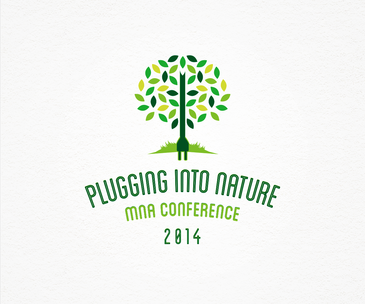
Plugging into Nature Conference Logo

Want to win a job like this?
This customer received 68 logo designs from 27 designers. They chose this logo design from Vic Earnst as the winning design.
Join for free Find Design Jobs- Guaranteed
Logo Design Brief
-Who we are/Target Audience-
We are the Minnesota Naturalists' Association, a volunteer based organization that puts on a conference every year for professional naturalists (nature center teachers) and environmental educators. The logo is to promote our annual conference theme to our members. Members are men and women, ages 24-70.
-Theme-
We are looking for a logo for this year's conference. The theme is "Plugging into Nature." The conference will be exploring ways to use both technology and traditional techniques to connect people to nature. There is a sub theme of alternative energy. Designs should plan on the theme of technology or green power connecting people to nature. Ideal designs will incorporate both technology and nature.
-Uses and Size-
The logo will be used for print materials such the conference schedule, room signs, etc. It will also be used online and in emails communicating about the event.
It should look good as small as 1.5 inch x 1.5 inch
The largest we will likely print it would be 8 inch x 8 inch.
A roughly 1/1 height to width ratio is preferable to a rectangular design for print layout purposes.
It will usually be on a white background though depending on the design and choices made by the conference committee later it may also appear on different colors. A transparent png file will be required.
We do not have an email template it must fit or match.
-Text-
The phrase "Plugging into Nature" should appear as well as "MNA Conference 2014."
-Colors-
We do not have restrictions as to the number of colors.
Nature toned colors are preferable to bright primary colors.
-Stylistic Preference-
Previous years have not followed a particular design aesthetic. The logo should be nature inspired and friendly. It should convey a connection to nature. We are not looking for a cold corporate look but also not a “kiddie” look as the conference is for adults. The conference is for educators who often work with children but the audience for the logo and conference is professional adults.
The past two years can be viewed at: http://mnnaturalists.org/events/conferences/past-conferences/
We were pleased with both of the past year’s designs but the 2012 design was too delicate to look good when shrunk down and we would like to avoid this as it will be used in multiple sizes.
Incorporation of the outline of the state of Minnesota is optional.
We’d like to avoid designs that merely incorporate our words into a geometric shape. The design should be evocative of connecting people to nature though technology.
We do not want something like these two:
http://rvrblog.riverland.edu/campusbuzz/files/2013/05/Minnesota-Simulation-Conference-Logo.jpg
http://www.artsalternatives.com/working_graphics_portfolio/logos/asfp_logo.gif
They are simply based on geometric shapes and do not convey any information about the conference.
These next three, while stylistically different from each other, all use design elements to tell a story which is more in line with what we are looking for. We are not wedded to the particular design style of these examples below, but rather the way in which they use creative identifiable elements instead of abstract shapes.
http://caff.org/wp-content/uploads/2012/06/CSA-conference-logo-credited.jpg
http://www.blog.colormarketing.org/wp-content/uploads/2010/07/2010-Fall-Conference-Logo-Portland.jpg
http://www.ecolandscaping.org/wp-content/uploads/2013/01/ELA-Conference-Logo-Tree-and-Globe.jpg
UPDATE:
We have received several designs incorporating the USB symbol. Many of our members are fairly technologically illiterate and would not recognize that symbol so we are looking to avoid that in designs.
Industry/Entity Type
Events
Logo Text
Plugging Into Nature MNA Conference 2014
Logo styles of interest
Pictorial/Combination Logo
A real-world object (optional text)
Look and feel
Each slider illustrates characteristics of the customer's brand and the style your logo design should communicate.
Elegant
Bold
Playful
Serious
Traditional
Modern
Personable
Professional
Feminine
Masculine
Colorful
Conservative
Economical
Upmarket
Requirements
Must have
- Needs elements that represent both technology or Alternative Energy AND nature or natural objects like trees, leaves, etc.
Should not have
- USB symbol