University "Satellite Navigation and Positioning (SNAP) Lab" re-launch needs a new logo!
Want to win a job like this?
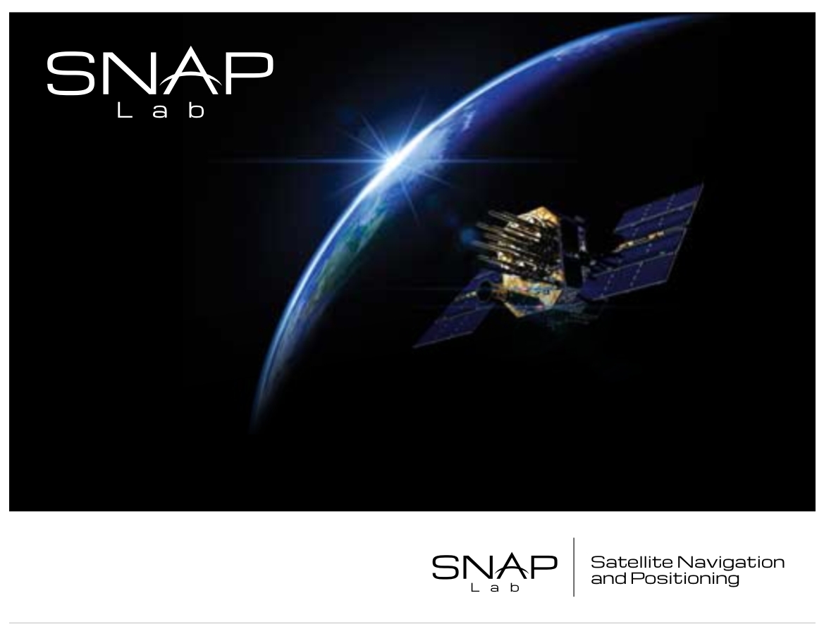
This customer received 97 logo designs from 25 designers. They chose this logo design from momo57 as the winning design.
Join for free Find Design Jobs-
 A$400
A$400
-
 97 designs
-
 25 designers
Logo Design Brief
We're looking for a new logo for the re-launch of our university based research lab specialising in Satellite Navigation and Positioning, otherwise known as the "SNAP Lab".
Our Faculty underwent a bit of a restructure over the past couple of years and in the transition the old facilities were lost. We're hoping to re-house the lab and bring back together the academics, researchers and industry stakeholders who were onboard before, as well as triggering new collaborations and invigorating new research.
In the past, the research lab produced a significant amount of award winning research, and alumni from the lab are now located in prominent positions around Asia. We expect the new lab to have a fairly Asia-Pacific region focus.
The old (and extremely outdated) logo, along with more info about the lab, its research and its history (founded in the early 1990s) can be found here: http://www.gmat.unsw.edu.au/snap/
A recent temporary/transitional treatment of the old logo has been attached.
We would like to be able to use the logo on print material and online, and would prefer something that can be viewed easily against both white and dark backgrounds.
- The first expected use of the logo will be on a pull-up vinyl banner (probably 850mm wide x 2000mm high) so any treatments that bear this in mind would be appreciated.
- The next use will likely be on a new website which will need to adhere to existing university branding guidelines (a good example of how the logo might be used can be found here on the Kirby Institute site: http://www.kirby.unsw.edu.au/)
Thanks for your ideas everyone!
UPDATE: We'll be amending the brief to include more detail shortly, stay tuned!
Updates
Hi guys, just to respond to a few of your questions:
i) the wods "SNAP" and "Lab" should be incorporated into the design,
ii) We would like some kind of visual representation of "where we are going" etc since this is for "Navigation" research
iii) ‘university’ is not part of the title
iv) We are open to the use of globes (i.e. the spheres/circles with the latitude/longitude lines) but we're trying to move away from our old logo a little so this is optional
v) Triangles and arrows are ok/optional
vi) Arcs are good
vii) Options that include the full wording along side the logo are welcome
Thanks for all your hardwork, we wil try to provide more feedback soon!
Added Thursday, June 26, 2014
Project Deadline Extended
Reason: We have extended our deadline by a few days because we have changed the way the new logo will be revealed - rather than presenting the logo at our Lab's launch party, we're going to let attendees at the launch party vote on our shortlist.
Added Thursday, June 26, 2014
Target Market(s)
Professionals from industry and other universities. A serious, mature and educated audience.
Industry/Entity Type
University
Logo Text
SNAP Lab
Requirements
Must have
- - Professional and clean looking.
- the words "SNAP" and "Lab" should be incorporated into the design
Nice to have
- - Some kind of visual representation of "where we are going" etc since this is for "Navigation" research .
- Arcs are good (but optional)
- Triangles and arrows are ok/optional
- Options that include the full wording along side the logo are welcome
Should not have
- - We would prefer not to see illustrations/outline of satellites integrated into the logo, we're looking for a little more simplicity.
- We are open to the use of globes (i.e. the spheres/circles with the latitude/longitude lines) but we're trying to move away from our old logo a little so this is optional