flash new copy writing agency needs logo
Want to win a job like this?
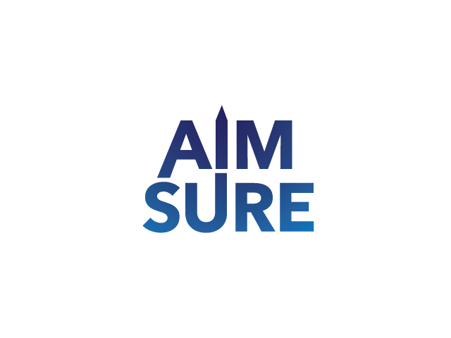
This customer received 68 logo designs from 20 designers. They chose this logo design from Square82 as the winning design.
Join for free Find Design Jobs- Guaranteed
-
 NZ$240
-
 68 designs
-
 20 designers
Logo Design Brief
I need a logo for a Mount Maunganui based (but want to come across as Auckland and London based as that's where all the work comes from) copy writing agency called Aim Sure. I like plain colours and an unfussy, clean look. Also like monochrome look. Although my main clients are corporate (and am aiming for as big as possible - aren't we all?) the logo doesn't have to be too corporate.
I want the design to communicate confidence, cleverness, academia, grown up but a bit fun. I'm not too keen on big logos alongside the text. I have attached a couple I like. I really like the Rule of Three website and logo as there is a vaguely regal feel about it which communicates an upper class, clever feel (hopefully).
I like the way the Sticky Content logo works inside the name. I would be happy to see just the name and no logo or a small logo. Need to steer well clear of the Hoopla design (although I do like the style, not keen on the font though) as a friend owns it! I don't like twirly fonts.
I like the Vortex logo because it shows what they are in an interesting way.
The name Aim Sure comes from XV squadron, a tornado squadron in the RAF which my father led in the 80s. He was a fighter jet pilot and the squadron specialised in combat and bombing. They won a hugely coveted bombing trophy called the Salmond Trophy. The logo does not need to reflect this, I just thought you may find it interesting. I will probably write a bit about it somewhere on the website.
Hope that's enough info.
Updates
Hi, thank you for your excellent designs. Please steer clear of any pencil or pen logos. thanks Jenny
Added Sunday, July 27, 2014
Project Deadline Extended
Reason: I'm still keen for a few more designs. Slightly less corporate would be great and more creative
Added Tuesday, July 29, 2014
Dear all, thank you for your designs. It all feels a little too corporate at the moment, centered around targets and arrows and pens and pencils. I'd love something lighter and more playful, possibly even humorous, for instance something like this
http://www.shadevfx.com/ - check out the shade logo in top left of their home page
Aim Sure is a creative agency, not too heavily corporate although we will be attracting corporate clients.
Added Wednesday, July 30, 2014
Target Market(s)
agencies (advertising, marketing agencies)
big names looking for copy writing services
Industry/Entity Type
Work
Logo Text
Aim Sure
Logo styles of interest
Character Logo
Logo with illustration or character
Wordmark Logo
Word or name based logo (text only)
Lettermark Logo
Acronym or letter based logo (text only)
Font styles to use
Colors
Designer to choose colors to be used in the design.
Look and feel
Each slider illustrates characteristics of the customer's brand and the style your logo design should communicate.
Elegant
Bold
Playful
Serious
Traditional
Modern
Personable
Professional
Feminine
Masculine
Colorful
Conservative
Economical
Upmarket
Requirements
Must have
- must be clear, not fussy
Should not have
- fussy logos, shouldn't look too corporate .
definitely don't like twirly fonts