ECommerce Site Redesign: overall site and specific pages
Want to win a job like this?
This customer received 61 web designs from 14 designers. They chose this web design from Creative Usha as the winning design.
Join for free Find Design Jobs- Guaranteed
-
 US$560
-
 61 designs
-
 14 designers
Web Design Brief
We have a website that has been in operation for 6+ years, and it's time for a visual refresh.
Our current website is located at http://vpo.ca
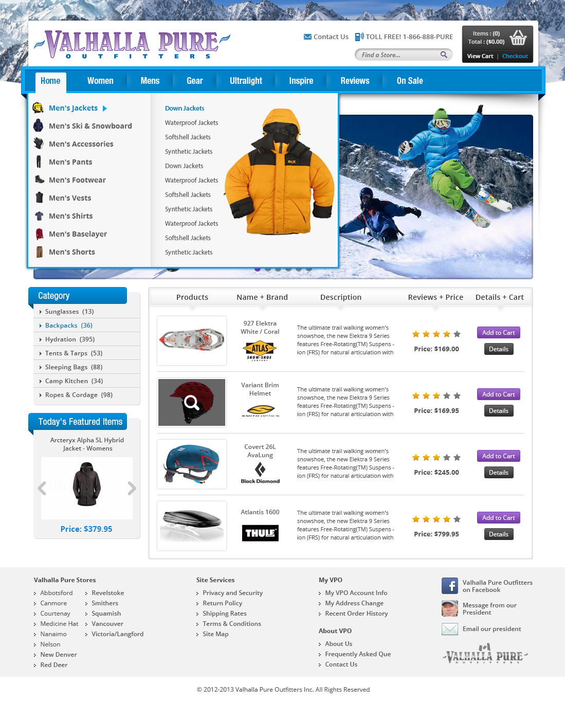
The only significant functional change will be the movement of the persistent vertical navigation bar from the left side up to a categorized horizontal navigation menu. I've attached a rough mockup of how we want this positioned.
No coding necessary; just PSDs. The attached ROUGH MENU MOCKUP.PSD contains a layer with our logo on white should you wish to include it in your submissions.
Updates
Further to the initial design I wanted to elaborate on the required elements for the horizontal navigation bar.
Looking at the ROUGH MENU MOCKUP.PSD, note that this would be a drop-down menu. The navigation hierarchy begins by clicking on a main menu item such as HOME, which drops down a large pane with:
- header image (the climber in the mockup)
- categories on the left with ItemCount (illustrated in purple)
- details
The details pane will be contextually relevant to the category selected. In the mockup, the user has clicked HOME to display the dropdown menu, then BACKPACKS on the left to show the BACKPACKS detail.
The details include:
- Heading ("Backpacks") with an relevant category icon
- Category Description text block "We specialize in Backpacks..."
- 10 featured supplier logos (grid view)
- (X) number of subcategories (dynamic number arranged in a grid view)
Added Friday, November 02, 2012
I've added a wireframe clearly describing what we're looking for with in terms of layout with the horizontal navigation element.
Please see the attached file
Added Tuesday, November 06, 2012
Project Deadline Extended
Reason: I didn't want to end the project contest on a weekend.
Added Friday, November 16, 2012
Project Deadline Extended
Reason: Sorry folks, designs are still rolling in. We'll eliminate a bunch and shortlist the competition. Thanks for all your submissions!
Added Thursday, November 22, 2012
Target Market(s)
We are an outdoor retailer focused on the high end of the market. We have a general color scheme on our site which we'd like to keep, but various elements need to be made consistent and more aesthetically pleasing.
Our brand is very important to us, and the site design must reflect our values of high quality and affluence. We cater to outdoor enthusiasts, hikers, back packers, and general high end apparel consumers.
Look and feel
Each slider illustrates characteristics of the customer's brand and the style your logo design should communicate.
Elegant
Bold
Playful
Serious
Traditional
Modern
Personable
Professional
Feminine
Masculine
Colorful
Conservative
Economical
Upmarket
Requirements
Must have
- In order to address the issue of consistency, we require strict design guidelines, including font sizing, element spacing, etc.
We require 7 page design templates for:
1.) overall site template - see http://vpo.ca for current.
* narrow static header bar (NEW)
* footer (KEEP SAME/SIMILAR)
* background
* body
* mini-cart (collapsed and expanded)
* promotion panel (ad box, rotating featured items)
* horizontal navigation bars (expanded/collapsed, grouped by 7 main categories) - see attached ROUGH MENU MOCKUP and see additional notes.
* recently viewed products
2.) product page (see http://vpo.ca/270599/icebreaker_legacy-hood-pure-plus-mens.aspx for current)
* product imagery/zoombox
* color, size, quantity selection
* add to cart button
* detail tabs
* In-store Availability info
* info panel near the add to cart box for exceptions including:
- Available to pick up in-store only
- Free shipping for your entire order when you purchase this item
- This item is over-sized; please contact a store directly
* "customers who bought this also bought" panel, grid listing of items
3.) product listings (category, search results, etc.)
* item thumbnails in grid format
* sidebar for refinement options (by supplier, by price, by size, etc.)
4.) generic information/content page (see http://vpo.ca/t-returns.aspx)
5.) store locations page (see http://vpo.ca/t-VPO.stores.04.aspx)
* store details
* map
* hours
* contact info
* local links
* contact form
6.) contact us form
7.) checkout (see attached current checkout screen shot)
* cart summary
* checkout steps
Any visual elements benefiting from hover effects will need to have both dimmed and hovered layers in the design.