Product page for a pain diary needs an impressive Wordpress Design
Want to win a job like this?
This customer received 36 Wordpress designs from 6 designers. They chose this Wordpress design from pb as the winning design.
Join for free Find Design Jobs- Guaranteed
-
 €770
€770
-
 36 designs
-
 6 designers
Wordpress Design Brief
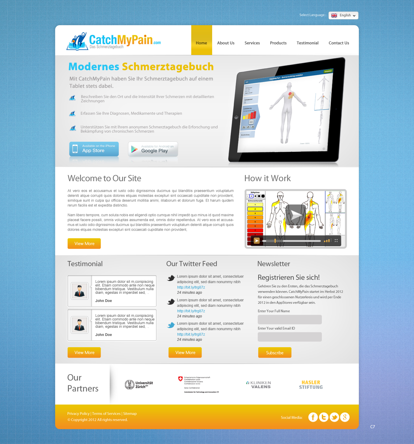
We are a small startup from Switzerland, called Sanovation AG (see www.sanovation.com). We are developing an application "CatchMyPain" which will be launched end of December/January. So far we only had a landing-page: www.catchmypain.com and now want to extend it to a complete website.
Our upcoming app is a diary which can be used by chronic pain patients to track their pain over time. Towards the end of this December we are going to launch a tablet app on iOS/android. A few months later a smartphone version and a desktop browser version will follow.
We think our product page should have 5 pages/categories:
- start page: there will be a video, some testimonials and links to app store and google play
- details: We explain why you should keep a diary and what CatchMyPain is? This page includes some screenshots of the application
- vision: we present our roadmap and our quest against pain
- FAQ: most important questions answered, links to support, includes a form as well
- about: link to sanovation.com-page, descriptions of who we are, team-picture
Here are some additional remarks:
- some pages/categories could have subpages at a later point. Please keep this in mind when designing the webpage.
- somewhere one the webpage, there should be a twitter-feed integrated "@CatchMyPain"
- The Webpage should run in a multiple-language mode. Currently, we are using the multiple language framework at http://wordpress.org/extend/plugins/multi-language-framework/ and have the site in German and English. The site design can be in one language only, but should there be graphics with text, we would need both versions. Ideally, you provide us with the “raw” format in addition. This way we can change the text ourselves.
- chronic pain is a serious (and oftentimes sad topic). However, the design should represent a positive attitude (hope) while appearing professional.
- You can reuse the color scheme of our CatchMyPain logo. However, we are also open to new color suggestions.
Updates
I added some newer screenshots from inside the application. The ones now existing on catchmypain.com are a bit old already.
Added Tuesday, December 11, 2012
general notes for all:
- only use official black / white (transparent) appStore icons, others aren't allowed by apple
- use newer screenshots for drafts (see brief)
- always have a navigation
- video should be prominent (size can be expanded upon click)
- main-page without slideshow (one static element is enough)
- different screenshots can still be used on other pages
most important items (things that should be seen at first glance without scrolling):
- screenshot
- appstore icons
- video
(- newsletter subscription)
Added Wednesday, December 12, 2012
generally we would like to have
- not too much black parts on the page, it can be fresh and friendly ;)
- no pics in background that have nothing to do with CatchMyPain
Added Thursday, December 20, 2012
Target Market(s)
Average app/web user who suffers from (chronic) pain
Industry/Entity Type
Store
Look and feel
Each slider illustrates characteristics of the customer's brand and the style your logo design should communicate.
Elegant
Bold
Playful
Serious
Traditional
Modern
Personable
Professional
Feminine
Masculine
Colorful
Conservative
Economical
Upmarket
Requirements
Must have
- - quick links to download the application from appstores
- newsletter subscription box, to subscribe with email-address
- support for English/German
- delivery as a Wordpress Theme/Plugin
Nice to have
- - an alternate styling for mobile version of the website.
_brief114534.png?AWSAccessKeyId=ASIARQT47ZIU7VUET324&Expires=1761374640&response-content-disposition=attachment%3Bfilename%3D%22photo%20%285%29%20Tuesday%2C%2011%20December%202012%2005_45_34.png%22&x-amz-security-token=IQoJb3JpZ2luX2VjEJv%2F%2F%2F%2F%2F%2F%2F%2F%2F%2FwEaCXVzLWVhc3QtMSJGMEQCIFod%2Bfq%2FMXjJPrLYiasHYgv4JPwdrkNxJenLw88H1Du%2FAiAK0uKErzHNwleZtciQw20bWtHIWwDLOSVP7bJMb6gHxSrrAwhUEAAaDDEwNDQxNTA4NzE0NSIMQ5%2FBxJuBgGJDDxo7KsgDo6fwm2Uo8vCmdeAw3mJ8KnTl5%2FcbYG56IGZi%2FniGnb%2B2blJYuPMHNOr4fSlIlW0twfNugCYpBw%2BnnIalGd7%2B2mqPmLSgco%2FjgA0LBsfy0jh31%2FQVo7tZPFgRL6WPow0APYzxKZ8MWWPAObS8svlI8s7a9mLpBc%2B9Is1APXk8LlWxiwaOJEg5w5Va76eydYFf5krjClG%2BezxeXtOguyAsZHGJo8kGrX8nwOmIYU2QjjGDPu8NIy%2BLY%2BnAfj3rr9fGJNc2bGBadQ4UFVey%2FmXxL6UvKCihBMale8gF%2Bux0MGoNQD7tis9lujXLDftpTyRQkRrbzl5KLZbYbRPx1GDjYJnOQxfbkEZTBUDIddx0kvrIrdjU3X%2BDMAmkGejl0%2FWG4Sm%2Bvw0MhoIP2sMcJxQIMKoYGawaQFwmg2aEtj%2F4SzYiqTUOIGD8uKWxnQulqpSvthZCBidEvJp9Q66Zj803F3UCb3XtKOQFW%2FmlPvkvFF7hyg2nT%2Bc4diyTN2IBDBAzQ8bPHwuqzZKtc7ew6%2FXXMSEjJL1CIakX1uCttBLoohybAkFYJ5pUG3P805OCgwfpGLqKUPKqg3824HUVlLk6Rn6ebKou1giwMILM68cGOqYBWqMEGcxDDjS510jhvjFPnBk1M4%2Bv4U4gkaHhQJXGtn%2BwLTDx02FQmCbxhwYARMk7mqfV3gCLGb9hUrNYyFQg2MOYcq%2FTzEZ8N1G9%2BNj2edBATy%2BI8nCJXnYhFYBXr8Yq6Iy0K6PdleIWLwQ3ArM1bjm7NrqEcSLjZdsQfn%2FRXGDXs3eR9HG283YzSNU8csQUjuifnV0CtZTy5oW5Wdh3bsHrW8f7ZA%3D%3D&Signature=qpMfAMWi6uTEPpp%2FOtmBOgCSreQ%3D)
_brief114534.png?AWSAccessKeyId=ASIARQT47ZIU7VUET324&Expires=1761374640&response-content-disposition=attachment%3Bfilename%3D%22photo%20%287%29%20Tuesday%2C%2011%20December%202012%2005_45_34.png%22&x-amz-security-token=IQoJb3JpZ2luX2VjEJv%2F%2F%2F%2F%2F%2F%2F%2F%2F%2FwEaCXVzLWVhc3QtMSJGMEQCIFod%2Bfq%2FMXjJPrLYiasHYgv4JPwdrkNxJenLw88H1Du%2FAiAK0uKErzHNwleZtciQw20bWtHIWwDLOSVP7bJMb6gHxSrrAwhUEAAaDDEwNDQxNTA4NzE0NSIMQ5%2FBxJuBgGJDDxo7KsgDo6fwm2Uo8vCmdeAw3mJ8KnTl5%2FcbYG56IGZi%2FniGnb%2B2blJYuPMHNOr4fSlIlW0twfNugCYpBw%2BnnIalGd7%2B2mqPmLSgco%2FjgA0LBsfy0jh31%2FQVo7tZPFgRL6WPow0APYzxKZ8MWWPAObS8svlI8s7a9mLpBc%2B9Is1APXk8LlWxiwaOJEg5w5Va76eydYFf5krjClG%2BezxeXtOguyAsZHGJo8kGrX8nwOmIYU2QjjGDPu8NIy%2BLY%2BnAfj3rr9fGJNc2bGBadQ4UFVey%2FmXxL6UvKCihBMale8gF%2Bux0MGoNQD7tis9lujXLDftpTyRQkRrbzl5KLZbYbRPx1GDjYJnOQxfbkEZTBUDIddx0kvrIrdjU3X%2BDMAmkGejl0%2FWG4Sm%2Bvw0MhoIP2sMcJxQIMKoYGawaQFwmg2aEtj%2F4SzYiqTUOIGD8uKWxnQulqpSvthZCBidEvJp9Q66Zj803F3UCb3XtKOQFW%2FmlPvkvFF7hyg2nT%2Bc4diyTN2IBDBAzQ8bPHwuqzZKtc7ew6%2FXXMSEjJL1CIakX1uCttBLoohybAkFYJ5pUG3P805OCgwfpGLqKUPKqg3824HUVlLk6Rn6ebKou1giwMILM68cGOqYBWqMEGcxDDjS510jhvjFPnBk1M4%2Bv4U4gkaHhQJXGtn%2BwLTDx02FQmCbxhwYARMk7mqfV3gCLGb9hUrNYyFQg2MOYcq%2FTzEZ8N1G9%2BNj2edBATy%2BI8nCJXnYhFYBXr8Yq6Iy0K6PdleIWLwQ3ArM1bjm7NrqEcSLjZdsQfn%2FRXGDXs3eR9HG283YzSNU8csQUjuifnV0CtZTy5oW5Wdh3bsHrW8f7ZA%3D%3D&Signature=2pTb2D4yQUT6jh949f1yP8xbCsA%3D)