Logo Design
Add your question or comments below

Some feedback would be nice.
Hi Ash,
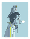
Thank you for your work on my project. The triangle concept is interesting but I find it rather busy and it I s not conveying much more then the K for Kuzbiel. Please help me understand what do you see in your design.
Hi,
It is more of an abstract mark and the formation of 'K' is only a subtle concept.Maybe the reason why you are finding it busy is coz you are viewing this in a perspective of compiled concepts.Rather view this only as a strong abstract mark.
You can share thoughts privately by using the feedback option.
Hi please leave feedback, and please let me know if I am on right track or no. Regards B.

Hi there,
I have submitted design for your brief if you want any changes like colors, design and font feedback me.
Thanks,
MK
-
 Previous page
- You're on page 1
- Page 1 of 1
-
 Next page
1 - 5 of 5 comments