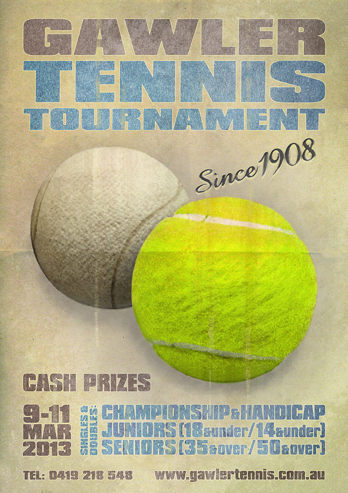
Poster for a 100 y.o. Tennis Tournament
Want to win a job like this?
This customer received 101 poster designs from 22 designers. They chose this poster design from GloveGraphics as the winning design.
Join for free Find Design Jobs- Guaranteed
-
 A$240
A$240
-
 101 designs
-
 22 designers
Poster Design Brief
I would like a poster designed to promote our tennis tournament but I'd like to avoid some of the clichés like the shadow of a player serving. Just well styled text would be fine but some clever imagery would be a bonus.
Highlighting the fact our tournament has been running for over 100 years would be nice so a retro design would work. But that doesn't mean a modern design, for example a minimalist approach utilising the lines of a tennis court, wouldn't work.
Updates
Our tennis committee is now in the process of short listing and will provide an update within 48 hours.
Added Monday, January 21, 2013
Industry/Entity Type
Court
Look and feel
Each slider illustrates characteristics of the customer's brand and the style your logo design should communicate.
Elegant
Bold
Playful
Serious
Traditional
Modern
Personable
Professional
Feminine
Masculine
Colorful
Conservative
Economical
Upmarket
Requirements
Must have
- The poster must contain the following text at a minimum:
"Gawler Tennis Tournament"/"Since 1908"
"9 March - 11 March, 2013" or "9-11 March, 2013", etc
"www.gawlertennis.com.au"
The poster must be reproducible in colour and black & white, or at least have an alternate for black & white.
The poster must be usable in both A3 and A4 sizes.
Nice to have
- The poster should contain the following text:
"Championship"
"Handicap"
"Seniors"
"Juniors"
Each above may be optionally succeeded by "Singles & Doubles", e.g. "Championship Singles & Doubles". It would actually be clearer if this additional text was used but would be repetitive, so alternate text "Singles & Doubles in all categories" might also be used. Alternatives for variety (with the first word the focus): "Championship Singles & Doubles", "Handicap Singles & Doubles", "Seniors 35+ & 50+", "Juniors 18&U, 14&U"
Ideally the poster will provision room for four to eight sponsors logos, preferably at the bottom, but failure to do this is not a show stopper.
The following text may also be used:
"Entries close February 24"
"Adelaide Cup Weekend"
Attached is a photo of one of the old trophies. Utilisation of the curved style of the "Gawler Tennis Tournament" text would fit in with the history if the tournament.
The ability to reuse elements of the poster in a single page website used to promote the tournament would be an advantage (as it will provide consistency).
If you could have an image of a tennis ball that conveys the same energy as the clock/tyre image in the attached "Back to the Future" poster, that would be cool. Or using split imagery of a wooden racquet and a modern racquet, but with some energy, would also be good. These are just ideas though and by no means essential.
I've also attached a photo of a t-shirt with a poster layout I thought looked good.
Some additional text that can be used:
"Brand new courts"
"Essex Park, Victoria Tce, Gawler"
"Phone 0419 555 555"
"Prizes and Trophies"