Logo Design Project

Want to win a job like this?
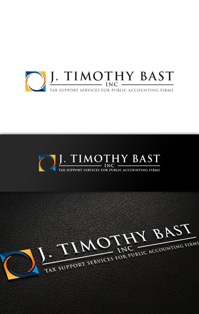
This customer received 166 logo designs from 68 designers. They chose this logo design from logo_s as the winning design.
Join for free Find Design Jobs- Guaranteed
Logo Design Brief
We need a logo design for a professional services firm called J. Timothy Bast Inc. The firm is essentially a very specialized tax accounting firm - instead of serving the end consumer, we support other public accounting firms in the area of Canadian and U.S. tax advisory and compliance (i.e. they call us on tax issues too complex for the general practitioner. Our byline is "Tax Support Services for Public Accounting Firms". We would like a design utilizing a navy blue and a bold orange. The final design needs to convey professionalism and trustworthiness (we're hired by accountants after all!) while being creative and eye-catching.
Updates
Hi folks,
Thanks for all your fine designs. You can see what I've eliminated and what is left to see the direction I'm going in. I'm going to give a few comments to help all of you.
1) Symbol should generally be abstract - not initials
2) Symbol to left of name, not above.
3) "Inc." should be in smaller letters - it is a legal necessity, but not key to the name
4) Eliminate the comma after Inc.
5) A navy blue background sets designs apart from others because it will create a strong logo on white background paper.
6) I am more attracted to serif fonts
7) A contrast between a capitalized name and lower case byline helps to set them off.
Hopefully these comments will help you to understand what looks good to me.
Added Tuesday, November 11, 2014
Hi all,
Great designs coming in. Many of the symbols are very angular - bars, checkmarks - squares, rectangles and triangles. However, the ones I'm liking are abstract and curvy - swirls, circles. I suggest stepping away from the "accounting" mindset altogether and try some symbols that evoke "thinking" and "reflection". Also, perhaps my suggestions of navy blue and orange was a bit restraining. At present, the images emphasize the dark blue a bit too much and aren't really eye-catching. I think that can be done without losing professionalism. Thanks for your continued effort.
Jeremy
Added Wednesday, November 12, 2014
Hi folks,
Thanks for the designs that keep coming in.
I don't know it I posted it earlier, but don't use my initials for the symbol. I want a symbol that is, as I've posted before, abstract - symbolic.
Thanks,
Jeremy
Added Wednesday, November 12, 2014
Thanks for all the great designs. I'm sorry that I can't respond in detail to each design, but with > 110 that is impossible. I'm narrowing the field but still accepting fresh ideas if anyone has any.
Added Friday, November 14, 2014
Industry/Entity Type
Graphic Design
Logo Text
J. Timothy Bast Inc., Tax Support Services for Public Accounting Firms