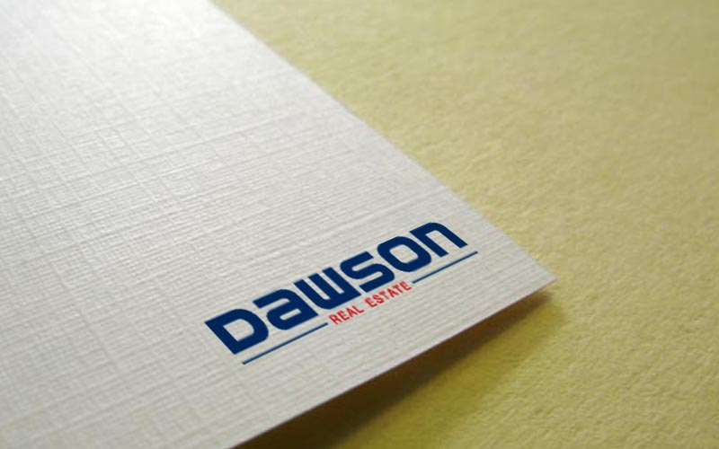
Logo design for long established Real Estate company
Want to win a job like this?
This customer received 113 logo designs from 56 designers. They chose this logo design from Olisoft as the winning design.
Join for free Find Design Jobs- Guaranteed
-
 A$320
A$320
-
 113 designs
-
 56 designers
Logo Design Brief
Commercial and Residential Real Estate agency (predominately commercial). Long established (est 1919) local agency Based in Doncaster VIC Australia. Highly regarded in the local community; we work on a large variety of properties ranging from Large commercial development projects to small commercial and residential properties. The company now is run and owned by 3rd generation Dawson.
Colour scheme of Dark Blue (similar to AMP www.amp.com.au) with a red
Industry/Entity Type
Residential
Logo Text
Dawson Real Estate
Logo styles of interest
Wordmark Logo
Word or name based logo (text only)
Colors
Colors selected by the customer to be used in the logo design:
Look and feel
Each slider illustrates characteristics of the customer's brand and the style your logo design should communicate.
Elegant
Bold
Playful
Serious
Traditional
Modern
Personable
Professional
Feminine
Masculine
Colorful
Conservative
Economical
Upmarket
Requirements
Must have
- A sense of timeless element and modernized look
Nice to have
- clean lines, clean look......nothing too fussy or overstated...
Should not have
- no images or deisgns of houses and buildings.