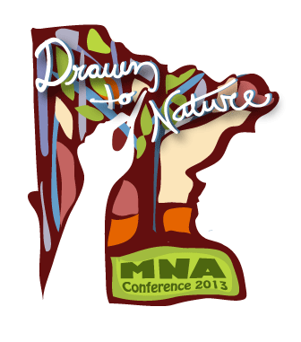
Minnesota Naturalists' Association Conference Logo
Want to win a job like this?
This customer received 99 logo designs from 11 designers. They chose this logo design from Angler Designs as the winning design.
Join for free Find Design Jobs-
 US$260
-
 99 designs
-
 11 designers
Logo Design Brief
The Minnesota Naturalists' Association (MNA) is a non-profit organization of professional environmental educators, park rangers, naturalists, interpreters and volunteers throughout the state of Minnesota and beyond.
The Minnesota Naturalists’ Association exists to advance natural and cultural resource interpretation for the purpose of fostering wise stewardship of all resources.
Each year, MNA hosts an annual conference and we are interested in commissioning a logo to give legs, vision and depth to our overall conference theme for 2013:
"Drawn to Nature"
The conference this year will have an art theme and focus. We selected "Drawn to Nature" as a nod to the literal art connection but also as play on what many of our organizational members feel about their profession-that they're "drawn" to it because they are drawn to nature and nature education.
We're recruiting a variety of mediums from performance art, storytelling, etc. to mediums like digital art, sculpture, painting, photography and much more. We hope to recruit keynote speakers such as photographer Jim Bradenburg or radio host Garrison Keillor.
We're especially interested in a logo that can speak to art in the literal sense but also combine nature-the art nature displays for us-the patterns in spider web, sand dunes, wind drifts, dappled light through a tree canopy...
The logo should include the text of our theme: "Drawn to Nature" as well as "MNA Conference 2013" or something similar. We plan to use it for mugs and conference swag.
For more information about our organization, please visit our website: www.mnnaturalists.org. Please especially view the Events-Annual Conference-Past Confereneces tab to see our logo and conference information from last year to get an idea of what we selected last year.
Updates
Hi Designers: I just uploaded a file: our selected conference logo from last year. Last year's conference had a geology theme. Hopefully that helps! Thanks for your patience too.
Added Thursday, February 14, 2013
Target Market(s)
It's got to look cool-something people would want to wear on a shirt or see on a mug.
Industry/Entity Type
Radio
Logo Text
Drawn to Nature MNA Conference 2013
Logo styles of interest
Emblem Logo
Logo enclosed in a shape
Pictorial/Combination Logo
A real-world object (optional text)
Abstract Logo
Conceptual / symbolic (optional text)
Character Logo
Logo with illustration or character
Look and feel
Each slider illustrates characteristics of the customer's brand and the style your logo design should communicate.
Elegant
Bold
Playful
Serious
Traditional
Modern
Personable
Professional
Feminine
Masculine
Colorful
Conservative
Economical
Upmarket
Requirements
Must have
- Must blend nature with art or vice versa...be creative!
Use 3 or 4 colors max for ease in screen printing, etc.
Nice to have
- The shape of the state of Minnesota is so interesting and beautiful, could that be worked into the logo somehow? It always reminds me of a tree with a large base and canopy...