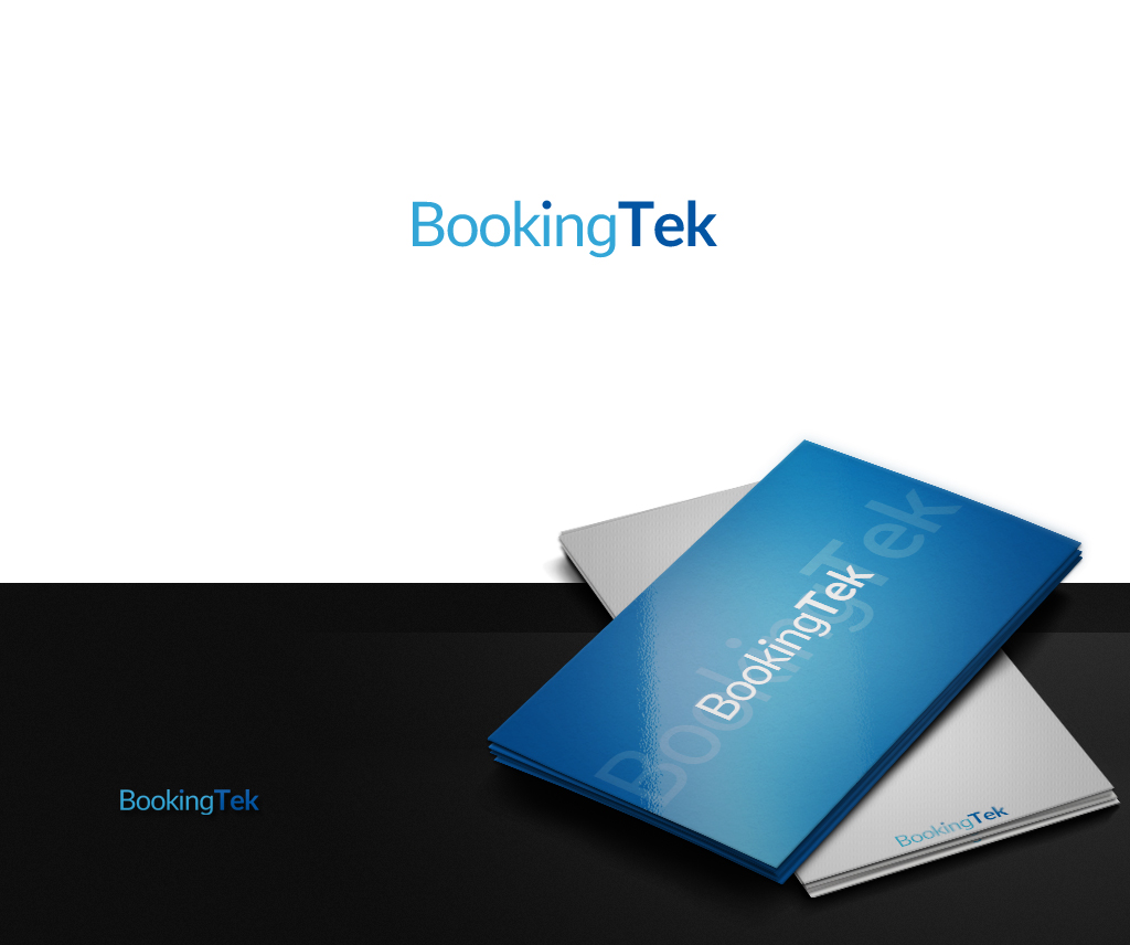
Logo for SaaS company called BookingTek
Want to win a job like this?
This customer received 92 logo designs from 25 designers. They chose this logo design from JohnM. as the winning design.
Join for free Find Design Jobs-
 £120
£120
-
 92 designs
-
 25 designers
Logo Design Brief
We are a SaaS company producing cloud-based disruptive software for hospitality. Our client base includes global hotel groups so we have to remain fairly simple and not too wild. The 'words' Booking and Tek could be different colours. We prefer blue colours and shades and maybe gray.
The T in Bookingtek coudl be capitalised or not.
We need our name in a plain, simple font like Apple for example. In front of the text we can have a small simple image but nothing easily recognisable which might look a bit cheesy - see samples attached.
Target Market(s)
Hotel owners both small groups and top 10 international groups
Industry/Entity Type
Software
Logo Text
BookingTek
Logo styles of interest
Wordmark Logo
Word or name based logo (text only)
Font styles to use
Colors
Colors selected by the customer to be used in the logo design:
Look and feel
Each slider illustrates characteristics of the customer's brand and the style your logo design should communicate.
Elegant
Bold
Playful
Serious
Traditional
Modern
Personable
Professional
Feminine
Masculine
Colorful
Conservative
Economical
Upmarket
Requirements
Must have
- Simple text based
- Two colours of text to highlight the two words
Should not have
- Fancy font
- Recognisable image
- Traditional