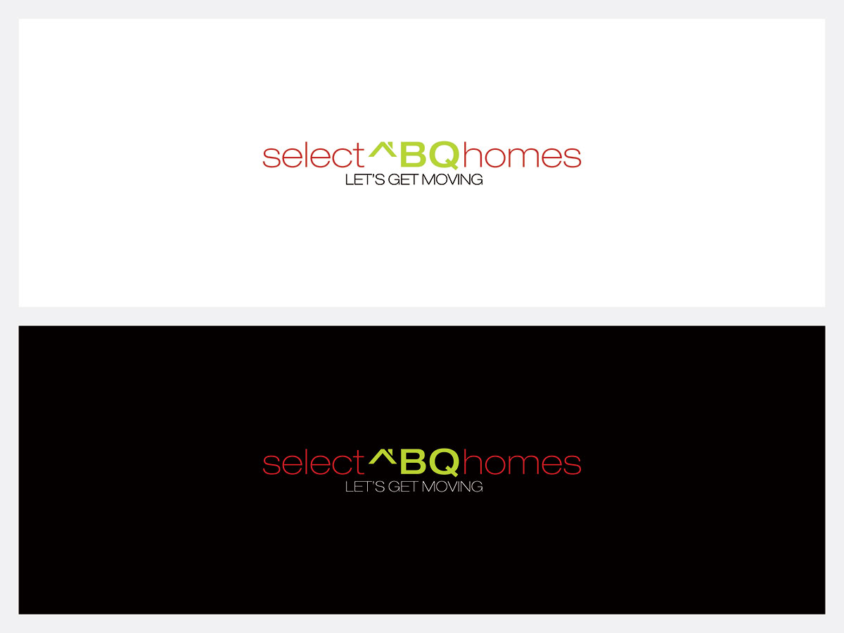
SelectABQhomes Logo

Want to win a job like this?
This customer received 90 logo designs from 22 designers. They chose this logo design from mint as the winning design.
Join for free Find Design Jobs- Guaranteed
Logo Design Brief
I am a realtor looking for a fresh, modern logo. My name is Elizabeth Estrada, and my real estate business name is SelectABQHomes. My concept is clean and minimal, yet creative. I consider myself part of the new generation of realtors, hip and full of ideas. My tag line is "Let's Get Moving!" I've thought about the possibility of incorporating the initial "E" somewhere within house icon. That would be the more subtle design element, and "SelectABQhomes" would be dominant, and can also display as selectABQhomes.com. I work for Keller Williams, so our color theme is red in conjunction with white, light grey, stone grey, and black, although I would not mind if the logo had red as the dominant color and another hint of a pop of color such as lime or tangerine. Logo should be identifiable and should convey, fresh, innovative, modern, savvy, fun realtor. Should be able to be used in conjunction with a business card, website, banner, social media, and any other marketing material. Prefer Helvetica style fonts or similar.
Updates
Prefer Helvetica style fonts or similar please. Thank you!
Added Thursday, January 22, 2015
Target Market(s)
Target market is buyers and sellers of real estate between the ages of 25 and 55 who
are internet savvy. We will be doing heavy internet and website marketing in conjunction with postcards, flyers, and business cards.
Industry/Entity Type
Real Estate
Logo Text
SelectABQhomes or SelectABQHomes or SelectABQhomes.com
Logo styles of interest
Emblem Logo
Logo enclosed in a shape
Pictorial/Combination Logo
A real-world object (optional text)
Wordmark Logo
Word or name based logo (text only)
Font styles to use
Other font styles liked:
- Combo of Helvetica, or Helvetica Light/Ultra Light
Colors
Colors selected by the customer to be used in the logo design:
Requirements
Should not have
- Too elaborate design elements, fonts that resemble times roman, nothing too busy, heavy looking, or overwhelming.