Opna - automatic access to tens of thousands of doors in Sweden
Opna needed a logo design and received 38 Conservative, Bold, Most professional services will be engaged logo designs from 6 designers
Designs
Designers
Budget


1 - 20 of 38 logo designs submissions
This is what Opna was looking for in their logo design
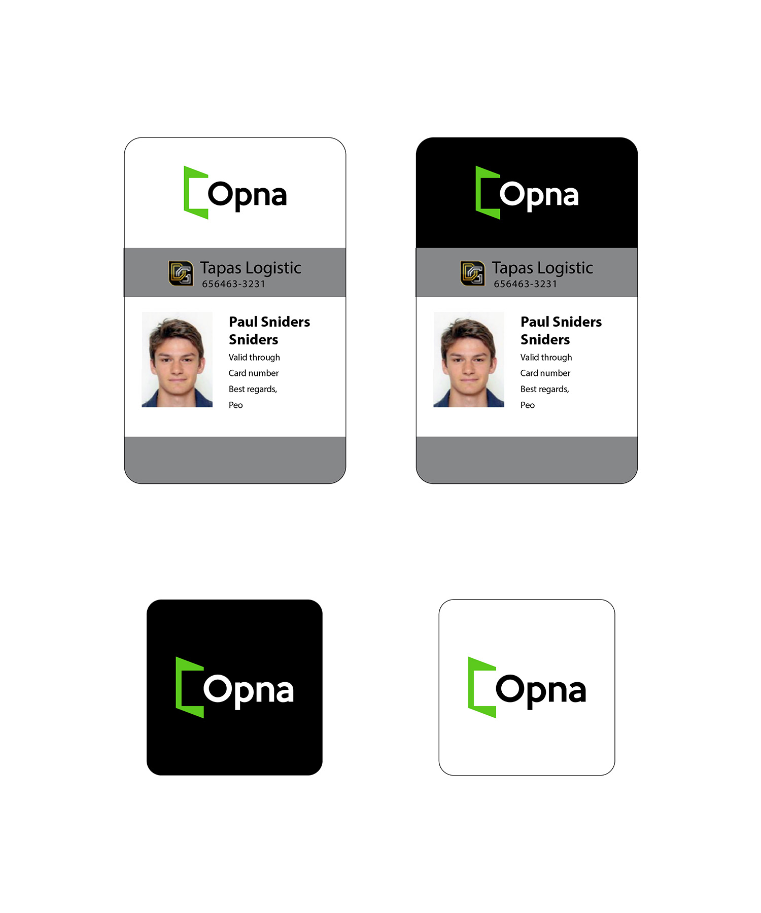
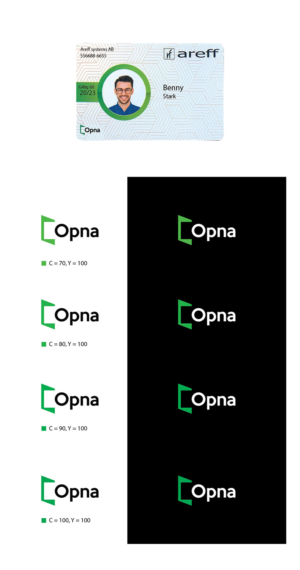
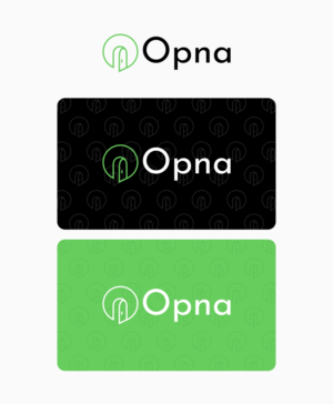
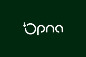
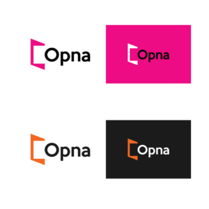
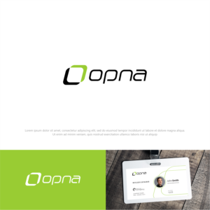
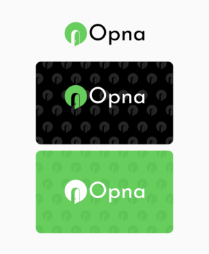
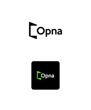
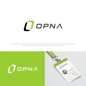
We need a crisp flat logo design that will work in green and/or black. The word Opna means to unlock or open up, in Icelandic or Old Norse. It will become a service that is a combination of an individual access control card and app for the automatic flow of information between different access control systems.
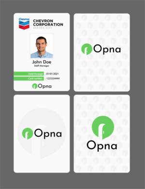
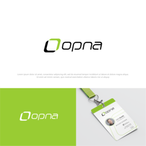
The logo will be printed on all plastic access control cards, will be used on a website and in the app.
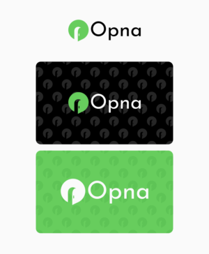
The feeling we want is safety, innovation, and technology, and it should be easily recognizable on these cards from a distance.
It would be a plus to get some kind of pattern or graphical illustration to work together with the logo to be used as a background for the card.
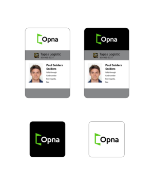
The card is the main visible product. The size is a standard access control card with the customer's company logo in color, company name, a picture of the cardholder, the name, and a job title. There will also be a "valid until" and the Opna logo - which means a lot of changing visual element…
Read more