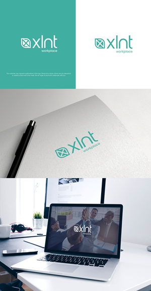
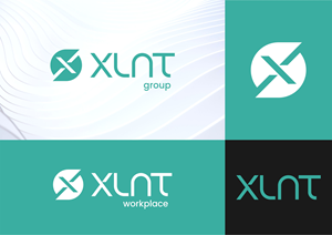
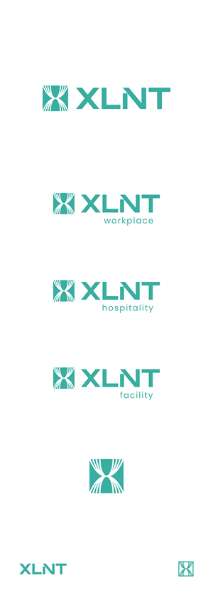
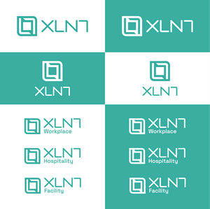
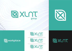
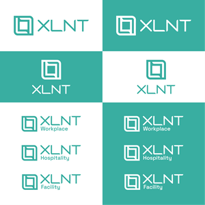
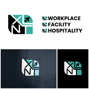
Rebrand for new company group
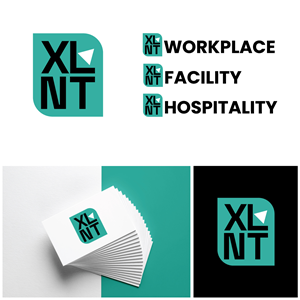
XLNT needed a logo design and received 72 Serious, Modern, Facility Management/Facility Services logo designs from 35 designers
Designs
Designers
Budget


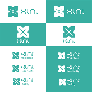
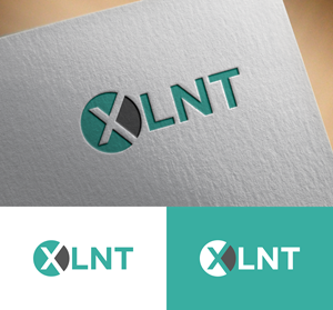

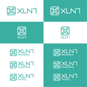


1 - 20 of 72 logo designs submissions
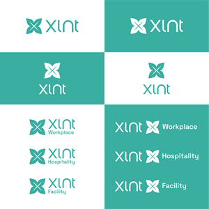
This is what XLNT was looking for in their logo design
Rebrand for new company group
[Update]--> As most submissions look very much alike it is a fault of the brief.
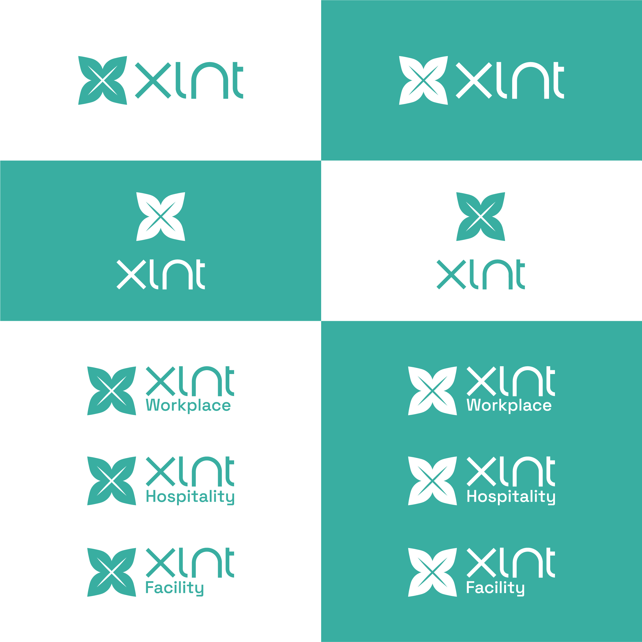
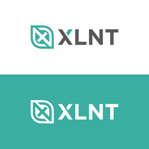
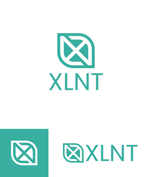
What we like the most about our current logo is that the text part looks hand made and unique. It looks sharp and crisp and has its own identity.
Each part, icon and text must be able to stand alone and make sense.
The icon that supports the text part of the logo just fits well and was not something that we requested, now some people have gotten used to it.
I think that the "N" that is inside the leaf shape representing sustainability is very well suited for that letter, making it looks like the sign for infinity (with some imagination) representing circularity.
I am not sure that the leaf shape is so well suited for an "X", most important is those parts mentioned above, the quality and that it ends up being better or at least similar in terms of quality.
[End of update]
We currently have three co…
Read more