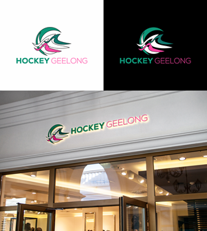
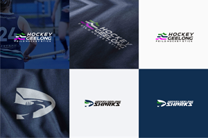
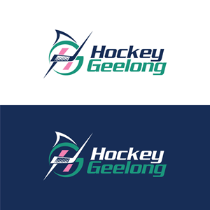
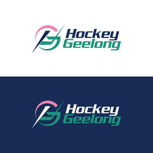
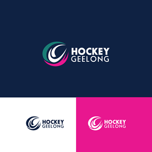
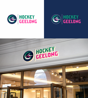
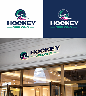
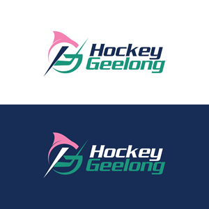
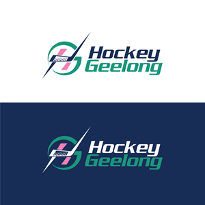
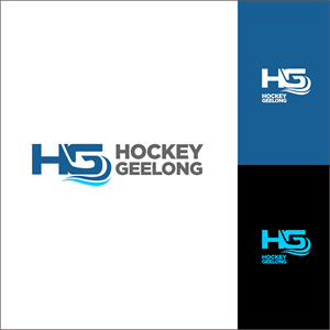
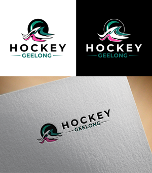
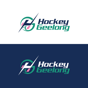
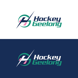
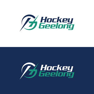
Hockey Geelong Logo
Hockey Geelong needed a logo design and received 97 Modern, Upmarket, Sport logo designs from 34 designers
Designs
Designers
Budget
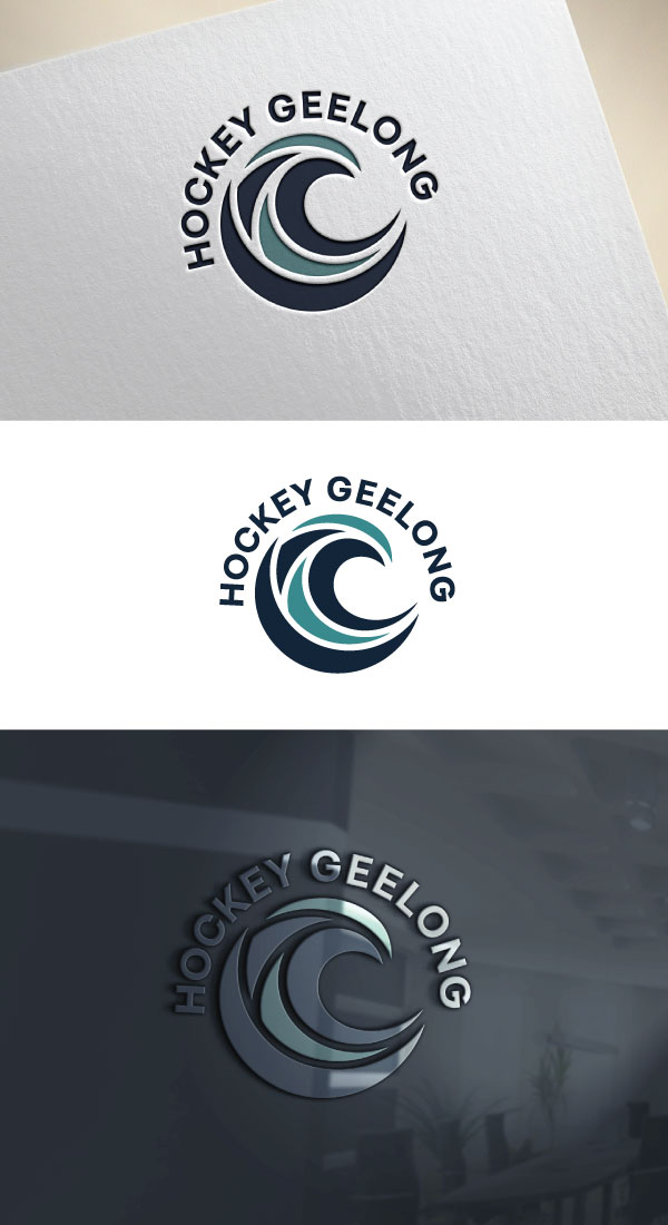
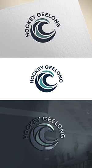


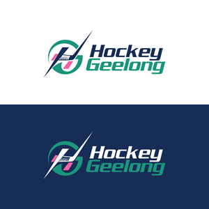
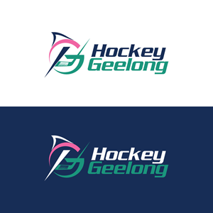
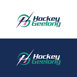
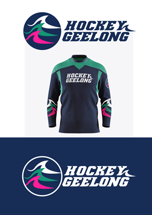


1 - 20 of 97 logo designs submissions
This is what Hockey Geelong was looking for in their logo design
Design Brief: Unified Logo for Hockey Geelong & Representative Teams
Background
Hockey Geelong (HG), formerly referred to as Geelong Hockey Association oversees community and representative field hockey across the Geelong region, Australia. We currently operate with 2 logos — one for the Association (HG) and one for our representative teams, the Hockey Geelong Sharks (Sharks)
We want to unify our identity under a single modern, versatile logo that reflects our values, heritage, and coastal identity.
Current Design Elements
The existing association logo features:
• Three wave-like forms, symbolizing our coastal location
• Navy and white to reflect the Geelong Cats and local sporting identity
• Forest green, a nod to our original association colours
• Mauve, chosen for distinctiveness among clubs using navy, green, or white
The representative team logo “Sharks” is more abstract and dynamic, often used for high-performance brand…
Read more