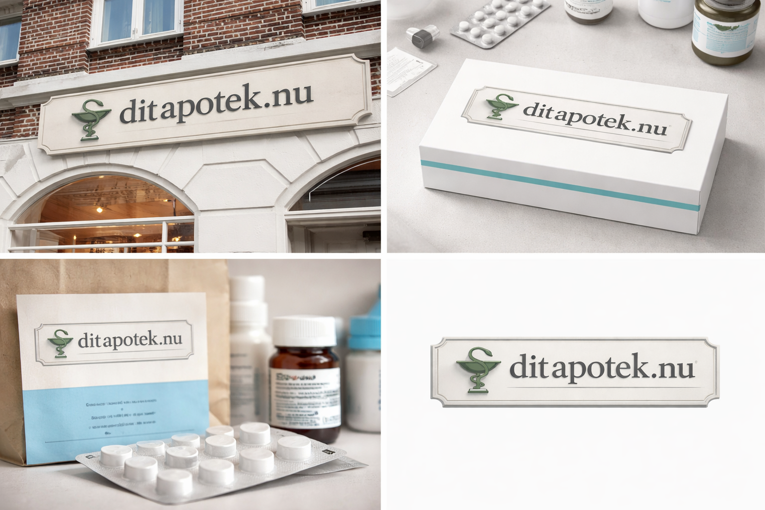
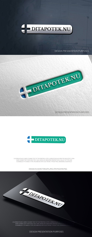
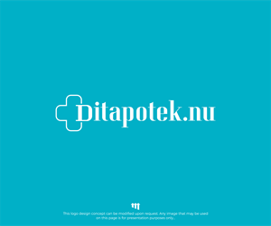
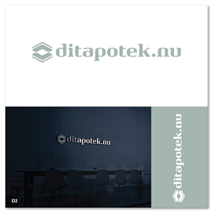
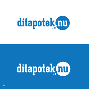
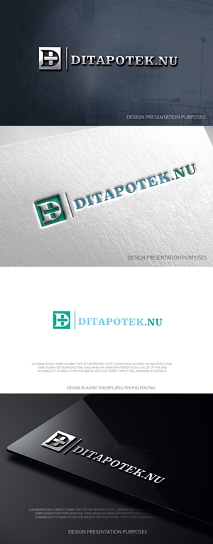
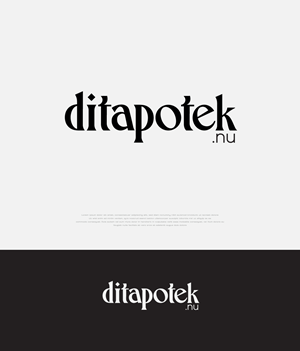
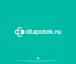
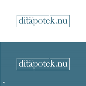
Logo Design for Danish Online Pharmacy Inspired by Traditional Apotek Signage
ditapotek.nu needed a logo design and received 130 Serious, Traditional, Retail pharmacy logo designs from 64 designers
Designs
Designers
Budget


1 - 20 of 130 logo designs submissions
This is what ditapotek.nu was looking for in their logo design
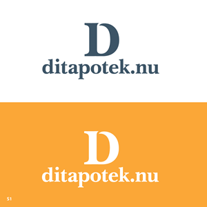
The logo must align visually with traditional Danish brick-and-mortar pharmacies (Apotek), which share a highly recognizable and consistent typographic style across Denmark.
Physical pharmacies in Denmark typically feature:
Strong serif typography
Dimensional or slightly embossed lettering
Neutral, muted color palettes
Clean, architectural presentation
A formal, authoritative tone
The objective is to create a logo for a Danish online pharmacy that feels like a natural extension of this established visual system.
It should:
Immediately signal “Danish pharmacy”
Feel legitimate and regulated
Resemble traditional Apotek signage in style
Avoid looking like a tech startup or wellness brand
Maintain simplicity and Scandinavian restraint
The logo should look as if it could realistically appear on a physical pharmacy facade in e.g. Copenhagen, while functioning effectively in a digital environment (website, mobile, packaging, pr…
Read more