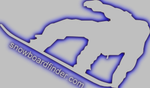
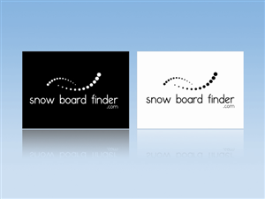
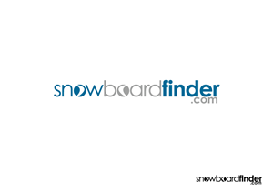
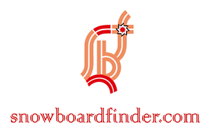
Snowboarding Price Comparison Site Logo
snowboardfinder needed a logo design and received 21 Elegant, Playful, Community logo designs from 17 designers
Designs
Designers
Budget

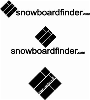

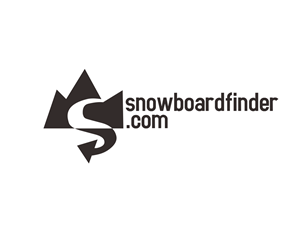
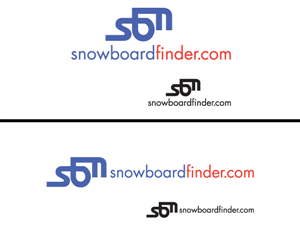

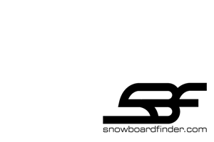


1 - 20 of 21 logo designs submissions
This is what snowboardfinder was looking for in their logo design
We have recently launched a snowboarding price comparison site snowboardfinder.com that seeks to offer the most comprehensive range of snowoarding apparel and boards to the snowoarboarding community in the US.
Our Target Audience is 16-30 Male Active Sports Partcipants.
Our Logo Design Requirements
The name snowboardfinder.com must be present and in lowercase
Logo needs to be legible in monotone, (white on black and black on white) as well as in color.
Logo needs to be easily recognizable in small formats.
Logo needs to work in both wide and long formats. (ie, being able to move the text to the left or below the pictorial)
The pictorial needs to capture the essence of the site and name.
The color palette needs to be harmonious. We will use the palette to define an overall brand guideline.
Crisp and defined edges. We like clean and uncluttered :)
We require the logo in Vector format (preferably eps & ai)
Logos from other snowboar…
Read more