Extreme Sports Clothing logo
Want to win a job like this?
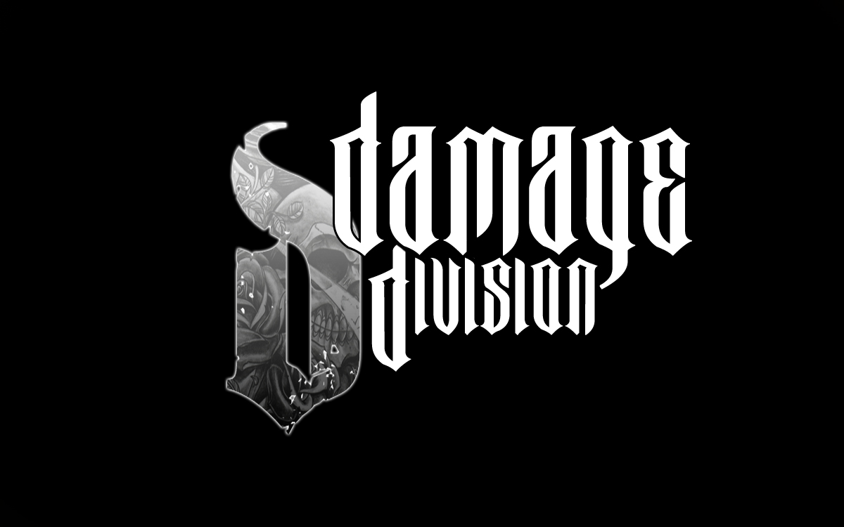
This customer received 228 logo designs from 71 designers. They chose this logo design from lukefrisch as the winning design.
Join for free Find Design Jobs- Guaranteed
-
 A$400
A$400
-
 228 designs
-
 71 designers
Logo Design Brief
Design Brief
Brand name: DAMAGE DIVISION.
Not sure in the early stages whether to just stick with the words Damage Division by themselves or to add something like Damage Division Streetwear so people get a better idea of what its all about..I suppose if the marketing image is visually done right it wont matter????
What would I like the logo to convey????
Here is some words that come to mind…..fast, sharp, dynamic, punk, angles, perspective, depth, penetration, stamp, branding mark, badge, dominant, powerful, professional, strong, attitude, group, organization.
Overall look and feel
Modern, stand the test of time, striking, recognizable, reproducible and clear in any size, fairly basic ( but not too basic...it needs to attract the males between 16 and 25)By basic I mean it should be like any good logo....not too overworked.Striking but with a twist somewhere which makes it stand out and be recognizable with a unique or custom font. THIS PART IS VERY IMPORTANT....A LOT OF DESIGNERS JUST SEEM TO BE GRABBING A FONT, WRITING THE WORDS DAMAGE DIVISION THEN SUBMITTING IT.....BELIEVE ME I HAVE BEEN THROUGH THE 4000 FONTS ON THE INTERNET AND THERE ARE SOME COOL ONES BUT I WOULD LIKE SOMEONE TO START WITH A GOOD FONT AS THE BASE THEN PLAY WITH IT TO GET IT TO LOOK CUSTOM/ORIGINAL. I HOPE THIS IS CLEAR. ALSO THE DD IMAGE IS SOMETHING I DONT REALLY WANT UNLESS IT IS DONE IN SOME VERY CLEVER WAY.
Type of logo
Either a wordmark, emblem or abstract logo. It would be nice to have some sort of symbol as well but if the wordmark alone can do its job well that will be all that is needed. I would prefer the logo to have straight lines rather than be rounded. I am presuming uppercase will work better. I would prefer not to see 2 'D' shapes in any form as a logo.....maybe one cool looking D but not two, and again nothing too rounded....prefer not rounded at all.
Target audience
At this stage it will be 95% male audience between 12 and 25…but look to having a small percentage of female appeal also. Extreme sports appeal from motocross, freestyle motocross, skateboard riders, BMX etc… even snowboard, wakeboard, surfers. Another possible market is UFC competing with brands like Tap Out.
Colour preference
Black, white and a red come to mind initially…..I always like to see a logo work well with just black and white then introduce colour later. Other colours that come to mind are slime green, orange, yellow…mainly striking bright stuff.
Additional info
Competition
Motocross: Fox, shift, oneill, unit,
Freestyle MX: Unit, hart and Huntington, srh, loosekid industries, metal mulisha
Skate: fallen, supra, cons, nike, element,
There are many more……
Updates
.A
LOT OF DESIGNERS JUST SEEM TO BE GRABBING A FONT, WRITING THE WORDS
DAMAGE DIVISION THEN SUBMITTING IT.....BELIEVE ME I HAVE BEEN THROUGH
THE 4000 FONTS ON THE INTERNET AND THERE ARE SOME COOL ONES BUT I WOULD
LIKE SOMEONE TO START WITH A GOOD FONT AS THE BASE THEN PLAY WITH IT TO
GET IT TO LOOK CUSTOM/ORIGINAL. I HOPE THIS IS CLEAR. ALSO THE DD IMAGE
IS SOMETHING I DONT REALLY WANT UNLESS IT IS DONE IN SOME VERY CLEVER
WAY.
Added Wednesday, June 15, 2011
below is a description I gave to try and explain one particular way this design could go. It should help in getting some more direction for the feel of the design.
I know its a hard one but its balance like sweet and sour. Sort of crazy
for the target market but also strong, recognisable and fairly easy to
read. Check out www.unitriders.com/australia/ or
www.hartandhuntington.com/
There seems to be an interest in the tattoo thing these days. I would
like to see a design 'loosely' based around this type of thing but not
real crazy letters where you cant read it or understand it
properly.....probably a little of the freehand feel.
Hope this helps.
Bearing in mind too that I am not a graphic designer and if you come up with another idea which you think will work feel free to submit it.
Thanks again.
Added Thursday, June 16, 2011
Target Market(s)
At this stage it will be 95% male audience between 12 and 25…(CORE BETWEEN 16 AND 22)but look to having a small percentage of female appeal also. Extreme sports appeal from motocross, freestyle motocross, skateboard riders, BMX etc… THEY ARE THE MAIN 4 MARKETS THEN TO A LESSER EXTENT snowboard, wakeboard, surfers. Another possible market is UFC competing with brands like Tap Out.
Industry/Entity Type
Marketing
Logo Text
Damage Division
Logo styles of interest
Emblem Logo
Logo enclosed in a shape
Abstract Logo
Conceptual / symbolic (optional text)
Wordmark Logo
Word or name based logo (text only)
Look and feel
Each slider illustrates characteristics of the customer's brand and the style your logo design should communicate.
Elegant
Bold
Playful
Serious
Traditional
Modern
Personable
Professional
Feminine
Masculine
Colorful
Conservative
Economical
Upmarket
Requirements
Must have
- A customised font. must appeal to the target market mainly male between 16 and 25 which are interested in motocross, bmx, skateboards etc.
Should not have
- A LOT OF DESIGNERS JUST SEEM TO BE GRABBING A FONT, WRITING THE WORDS DAMAGE DIVISION THEN SUBMITTING IT.....BELIEVE ME I HAVE BEEN THROUGH THE 4000 FONTS ON THE INTERNET AND THERE ARE SOME COOL ONES BUT I WOULD LIKE SOMEONE TO START WITH A GOOD FONT AS THE BASE THEN PLAY WITH IT TO GET IT TO LOOK CUSTOM/ORIGINAL. I HOPE THIS IS CLEAR. ALSO THE DD IMAGE IS SOMETHING I DONT REALLY WANT UNLESS IT IS DONE IN SOME VERY CLEVER WAY.