Logo Design Project
Want to win a job like this?
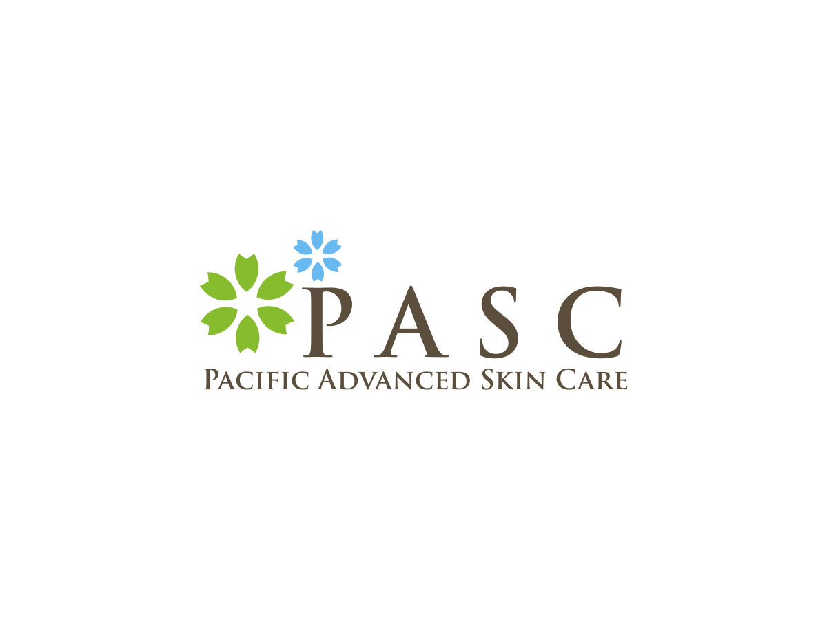
This customer received 76 logo designs from 26 designers. They chose this logo design from R16 as the winning design.
Join for free Find Design Jobs- Guaranteed
-
 US$200
-
 76 designs
-
 26 designers
Logo Design Brief
Overview
In 2006, Pamela established the PASC brand. A new logo, color palette and menu offering was developed. Today the business is positioning to become the leader in skincare in San Luis Obispo and surrounding communities. With this new positioning comes a new menu offering, enhanced customer experience and new treatment options. To support the refined direction of PASC, we would like to update and refresh the current branding to reflect a more polished and “grown-up” look and feel.
Objective
To refresh the logo / branding for PASC. Develop an updated and lighter color palette, refine the current flower component and explore new name treatments.
Deliverables
Show options for refining the flower in the logo
Refreshed color palette to brighter greens and blues, less use of the brown tones
New font treatments for the name
Considerations
Explore background treatments and patterns for menu, gift and note cards, bags and
Natural elements; sea and earth tones; plant and flower based derivatives
Holistic, calming, healing elements
Clinical, refined and polished; high-end
Clientele: The hair removal client base is mainly younger women anywhere from 15 - 35. The skincare clients tend to be a bit older and well established.
Industry/Entity Type
Hair
Logo Text
Pacific Advanced Skin Care
Logo styles of interest
Pictorial/Combination Logo
A real-world object (optional text)
Look and feel
Each slider illustrates characteristics of the customer's brand and the style your logo design should communicate.
Elegant
Bold
Playful
Serious
Traditional
Modern
Personable
Professional
Feminine
Masculine
Colorful
Conservative
Economical
Upmarket
Requirements
Must have
- please refine the current flower