Sydney Cosmedic – Logo Redesign (Sub-Brand of Specialist Medical Services Group)
Want to win a job like this?
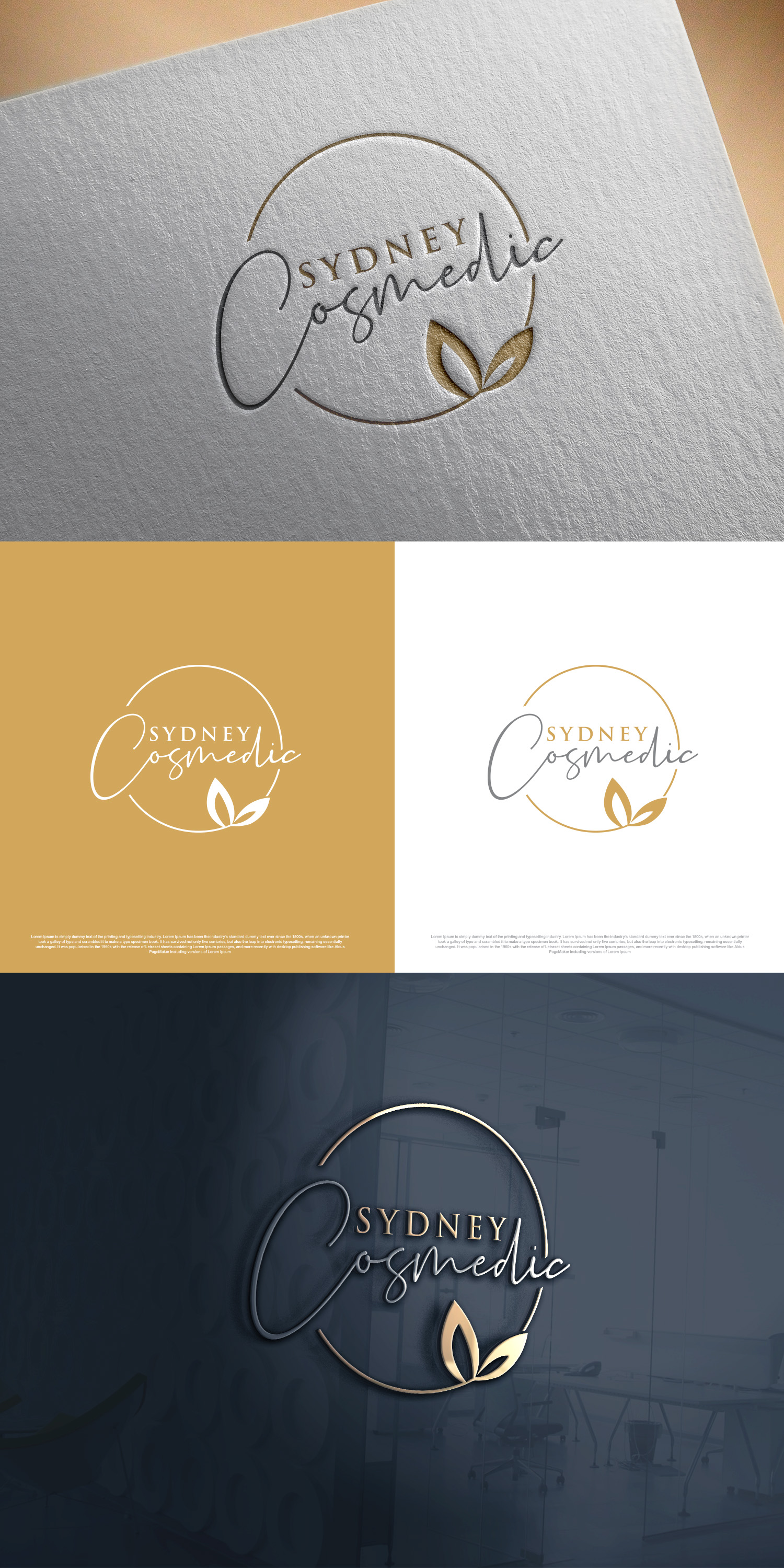
This customer received 179 logo designs from 72 designers. They chose this logo design from Ahsan Designs as the winning design.
Join for free Find Design Jobs-
 A$150
A$150
-
 179 designs
-
 72 designers
Logo Design Brief
Sydney Cosmedic is a modern cosmetic medical clinic centred on natural, refined and confidence-enhancing results. We are seeking a brand refresh that elevates the clinic’s positioning while maintaining recognisability. The goal is to modernise and refine the visual identity so it reflects premium quality, clinical expertise and understated luxury.
The updated branding should feel sophisticated, clean and timeless. It must balance medical credibility with aesthetic elegance — conveying professionalism, trust and safety while still feeling aspirational and polished. We want to avoid anything overly trendy, flashy or excessively feminine. Instead, the direction should feel elevated, refined and enduring.
We are open to complementary colour palettes commonly used in upscale cosmetic branding, such as soft neutrals, warm taupes, muted blush tones, charcoal, ivory or subtle metallic-inspired hues. The final palette should feel cohesive, luxurious and minimal rather than busy or high-contrast.
A key element we would like to retain or reinterpret is the outline of a woman’s face incorporated subtly within the design. This could be refined into a more abstract, minimal line illustration that feels elegant rather than illustrative. We are also open to incorporating tasteful cursive or script elements within the typography to add softness and femininity, provided the overall look remains professional and highly legible.
The branding should feel cohesive and streamlined across digital platforms, social media, packaging, signage and in-clinic applications. It should translate seamlessly into a high-end environment and sit comfortably within a specialist-led medical group.
This is an evolution of Sydney Cosmedic — maintaining its essence while elevating the visual identity to better reflect its premium positioning, expertise and refined patient experience.
Original logo attached for reference.
Updates
We would like to update the creative direction for the Sydney Cosmedic brand redesign. While we are aiming for a sleek, elegant and premium aesthetic, we do not want the branding to feel overly feminine or gender-specific. The brand should be refined and sophisticated, but ultimately gender neutral — appealing confidently to both women and men seeking high-quality cosmetic medical treatments.
The overall look should feel modern, minimal and elevated, with a strong sense of clinical credibility. We would like to retain an element of elegant cursive or script styling within the typography, particularly in the way the brand name is presented. However, this script should feel polished and contemporary rather than decorative or overly delicate. The cursive element should enhance the brand’s sense of refinement and luxury without compromising professionalism or readability.
The design should avoid overly soft blush palettes or stereotypically feminine colour schemes. Instead, we are open to neutral, muted or high-end tones — such as warm neutrals, charcoal, taupe, champagne, deep greens or soft metallics — that communicate understated luxury and confidence.
Overall, Sydney Cosmedic should feel premium, timeless and clinically credible, with an elegant typographic presence that is distinctive yet balanced. The brand should project confidence, subtle enhancement and trust, appealing to modern clients who value natural-looking results in a sophisticated medical environment.
Added Saturday, 21 February 2026
Target Market(s)
Sydney Cosmedic’s target market primarily consists of adult men and women seeking non-surgical cosmetic treatments who value natural-looking, subtle enhancements rather than dramatic or artificial results. The core demographic is typically women aged 25–55, including working professionals, business owners and mothers who are financially independent and willing to invest in premium cosmetic medical services. They are appearance-conscious but prefer a refined, understated aesthetic and are drawn to clinics that emphasise safety, medical credibility and ethical practice. This audience is generally educated, digitally engaged and influenced by social media, online reviews and word-of-mouth referrals. They prioritise trust, practitioner expertise and a high-end patient experience over low-cost treatment options. Many are interested in preventative treatments in their late 20s and 30s, while others in their 40s and 50s seek maintenance and age-management solutions that preserve a natural look. A secondary market includes men seeking subtle cosmetic treatments, as well as patients referred internally through the broader medical group who value a medically supervised cosmetic environment. Overall, Sydney Cosmedic’s target market is composed of modern, health-conscious individuals who want premium cosmetic care delivered in a professional, sophisticated and trustworthy setting.
Industry/Entity Type
Healthcare
Logo Text
Sydney Cosmedic
Logo styles of interest
Pictorial/Combination Logo
A real-world object (optional text)
Abstract Logo
Conceptual / symbolic (optional text)
Wordmark Logo
Word or name based logo (text only)
Lettermark Logo
Acronym or letter based logo (text only)
Colors
Colors selected by the customer to be used in the logo design:
Look and feel
Each slider illustrates characteristics of the customer's brand and the style your logo design should communicate.
Elegant
Bold
Playful
Serious
Traditional
Modern
Personable
Professional
Feminine
Masculine
Colorful
Conservative
Economical
Upmarket
Requirements
Must have
- The redesigned Sydney Cosmedic brand must embody a sleek, elegant and distinctly refined aesthetic. The visual identity should feel feminine in a sophisticated and modern way — not overly girly or trendy, but graceful, polished and elevated. It should communicate beauty, confidence and subtle luxury while maintaining strong medical credibility and professionalism. The overall design must feel premium and minimal, with clean lines, balanced spacing and a timeless composition. Typography should lean toward refined, high-end styling — potentially incorporating elegant serif elements or soft, modern letterforms that convey luxury and confidence. The colour palette should reflect understated femininity, such as soft neutrals, muted blush tones, warm taupes, champagne hues or deep, rich accents that evoke exclusivity and sophistication. The branding must feel cohesive and adaptable across digital platforms, social media, clinic interiors, packaging and print materials. It should photograph beautifully, work seamlessly in monochrome, and maintain its elegance whether scaled for signage or used subtly on collateral. Above all, the new design must position Sydney Cosmedic as a premium cosmetic medical brand — sleek, feminine, confident and clinically credible — appealing to modern women who value refined, natural enhancement in a luxurious yet professional environment.